Learn smarter with fresh insights from our tutors.
Practical study guides, course supplements, and learning resources curated to help you move faster through every subject.
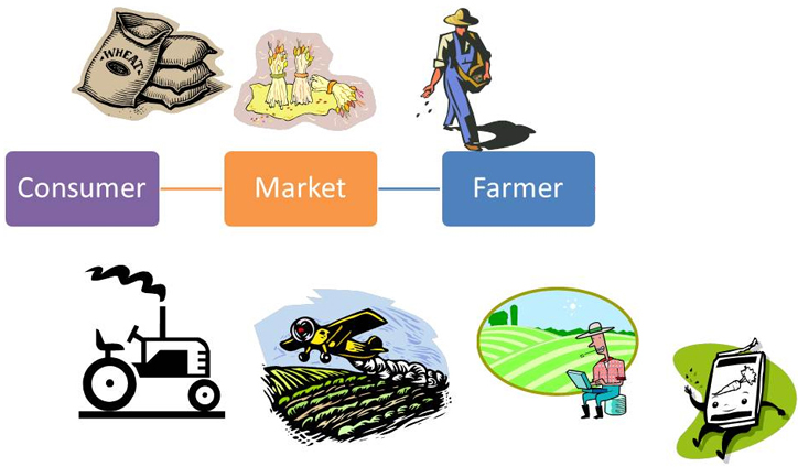
Cultivating Success: Agribusiness Financing Strategies

Agribusiness Financing Strategies
Welcome to the world of agribusiness, where seeds are sown, crops are harvested, and dreams take root. In this dynamic industry that intertwines agriculture and business principles, success is cultivated through innovation, hard work, and strategic financing strategies.
But what exactly is agribusiness? And why is it so important in today's ever-evolving global market? Join us as we explore the fascinating realm of agribusiness and dive into the various financing options available to help farmers and entrepreneurs thrive. Whether you're a seasoned professional or just beginning your journey in the field of agriculture, this blog post will arm you with valuable insights to cultivate success in your own agribusiness venture.
So grab your shovel (or laptop) as we dig deep into the world of agribusiness financing! Let's get started on this exciting journey together.
What is Agribusiness?
Agribusiness, at its core, is the intersection of agriculture and business. It encompasses all aspects of agricultural production, processing, distribution, and marketing. In simple terms, it involves the cultivation of crops and the rearing of livestock with a focus on generating profit.
But agribusiness goes beyond traditional farming practices. It incorporates modern techniques such as precision agriculture, biotechnology advancements, and sustainable farming methods. This industry plays a vital role in meeting the growing demands for food, fuel, fiber, and other agricultural products around the world.
Within agribusiness are various sectors that cater to different needs. From large-scale commercial farms to family-owned operations or even specialized niche markets like organic farming or aquaculture – there is no one-size-fits-all approach when it comes to agribusiness.
What sets agribusiness apart from conventional agriculture is its emphasis on efficient resource management and maximizing productivity while adapting to changing market dynamics. Agribusiness professionals must navigate complex supply chains, handle risks associated with weather conditions or commodity price fluctuations and make strategic decisions to ensure profitability.
In essence,'agripreneurs' need a strong foundation in both agricultural knowledge and business acumen to succeed in this ever-evolving field. It requires an understanding of market trends, consumer demand patterns, and technological advancements that drive innovation within the industry.
By leveraging technology-driven solutions, sustainable practices, and effective financial strategies,"agriprenuers" can not only enhance their own businesses but also contribute significantly towards global food securityand economic growth.
Agribusiness offers a unique blend of tradition and progressiveness, a harmonious marriage between age-old practices and cutting-edge innovations.
Cultivating success in this dynamic landscape means staying ahead of the curve, fostering collaboration, and embracing change. Every day brings new challenges yet holds boundless opportunitiesfor those who dareto sow theseeds ofsustainable prosperity.
Why is Agribusiness Important?
Agribusiness plays a vital role in our society and economy, making it an essential industry to support. But why exactly is agribusiness important? Let's explore.
First and foremost, agribusiness is crucial for ensuring food security. With a growing global population, the demand for food continues to increase. Agribusinesses help meet this demand by producing and distributing agricultural products efficiently.
Moreover, agribusiness creates employment opportunities both directly and indirectly. From farmers working on the fields to individuals involved in processing, marketing, and transportation of agricultural goods - countless jobs are generated within this sector. This not only contributes to economic growth but also alleviates poverty by providing livelihoods for many people.
Additionally, agribusiness plays a significant role in rural development. By investing in agriculture-related infrastructure and technology, it helps improve living standards in rural areas. It encourages sustainable farming practices while promoting innovation and technological advancements that enhance productivity.
Furthermore, agribusiness contributes to international trade by exporting agricultural commodities across borders. This brings foreign exchange earnings into the country's economy while fostering trade relationships with other nations.
Agribusiness has a direct impact on environmental sustainability efforts as well. Sustainable farming practices promoted by these businesses aim at minimizing resource depletion and reducing negative environmental impacts such as pollution or deforestation.
In conclusion (without explicitly stating "in conclusion"), we can see that agribusiness holds immense importance due to its contribution towards food security; job creation; rural development; international trade; as well as its positive impact on environmental sustainability efforts.
The Different Types of Agribusinesses
When it comes to agribusiness, there are a wide variety of enterprises that fall under this umbrella term. From crop production and livestock farming to food processing and distribution, the possibilities are vast. Each type of agribusiness presents its own unique challenges and opportunities.
Crop production is one common type of agribusiness that involves cultivating crops such as grains, fruits, vegetables, or herbs. This could range from large-scale commercial farms to smaller family-owned operations. Livestock farming, on the other hand, focuses on raising animals for meat, milk, eggs or wool production. This includes dairy farms, poultry farms, cattle ranches and more.
Another aspect of agribusiness is food processing which involves transforming raw agricultural products into value-added goods like canned foods or packaged snacks. Additionally, there's agricultural machinery manufacturing where companies produce equipment used in agriculture such as tractors or irrigation systems.
Lastly but certainly not least is agricultural services which include activities like consulting services for farmers or soil testing laboratories offering analysis for optimal fertilization plans.
Each type of agribusiness requires different strategies and financing options based on their specific needs and goals. Understanding these differences can help entrepreneurs make informed decisions about how best to finance their ventures and cultivate success in the industry.
The Different Types of Financing for Agribusinesses
Agribusinesses, like any other business, require financing to thrive and grow. There are various types of financing options available for agribusinesses, each with its own advantages and considerations.
One common form of financing is through traditional banks or financial institutions. These lenders offer loans specifically tailored to the needs of agribusinesses, such as equipment loans or operating lines of credit. This type of financing often requires collateral and a solid credit history but can provide competitive interest rates.
Another option is government-backed loans, such as those offered by the Small Business Administration (SBA) in the United States. These loans typically have favorable terms and lower down payment requirements compared to traditional bank loans. However, they may come with more paperwork and longer approval processes.
Venture capital firms also play a role in agribusiness financing. They invest money into promising start-ups or existing businesses with high growth potential. While venture capital can provide significant funding, it often comes with relinquishing some control over your business.
Crowdfunding platforms have gained popularity in recent years as an alternative way to raise funds for agribusiness projects or initiatives. By leveraging social media networks and online communities, entrepreneurs can attract small investments from a large number of individuals who believe in their ideas.
Moreover, agricultural grants are another type of funding option that may be available for certain projects or research endeavors within the industry. Grants are typically provided by government agencies or foundations interested in supporting innovation and sustainability practices within agriculture.
Each type of financing has its own pros and cons depending on factors such as the stage of your business, size of investment required, risk tolerance level, and long-term goals. It's important for agribusiness owners to carefully evaluate these options before deciding which one suits their specific needs best.
The Pros and Cons of Each Type of Financing
When it comes to financing agribusinesses, there are several options available. Each type of financing has its own set of pros and cons that need to be carefully considered before making a decision.
One common form of financing for agribusinesses is traditional bank loans. These loans offer competitive interest rates and can provide the necessary capital for expansion or investment in new equipment or technology. However, securing a bank loan can be challenging, especially for small or start-up businesses without established credit histories.
Another option is government-backed loans through programs like the United States Department of Agriculture (USDA) Farm Service Agency (FSA). These loans often have more lenient qualification requirements and can offer lower interest rates than traditional bank loans. However, they may come with additional restrictions or paperwork that can slow down the application process.
Venture capital funding is another possibility for agribusiness financing. This involves securing investments from individuals or firms who believe in your business idea and are willing to take on some risk in exchange for potential long-term returns. While venture capital funding can provide significant financial resources, it typically requires giving up some control over your business and sharing profits with investors.
Crowdfunding has emerged as a popular alternative form of financing in recent years. It allows entrepreneurs to raise funds by pitching their business ideas online to a large number of potential investors who contribute smaller amounts each. This method offers an opportunity to validate your concept while also generating funds; however, it requires strong marketing skills and persuasive storytelling abilities.
Self-financing remains an option worth considering for many agribusiness owners. By using personal savings or assets as collateral, you maintain full control over your business operations without needing external support; however this approach carries all the risk alone if things don't go according to plan.
Sustainable Farming Practices with Financial Benefits

Sustainable Farming Practices with Financial Benefits
Welcome to our blog post on sustainable farming practices with financial benefits! Are you curious about how farmers can not only help the planet but also boost their bottom line? Well, you've come to the right place. Sustainable farming is a growing trend that focuses on cultivating food and resources in ways that are environmentally friendly, economically viable, and socially responsible.
In this article, we will explore what sustainable farming entails, delve into its numerous benefits, discuss the costs associated with adopting these practices, and highlight the financial advantages of embracing sustainability. So grab a cup of coffee (preferably fair trade!), sit back, and let's dive into the world of sustainable agriculture!
What is Sustainable Farming?
Sustainable farming is a holistic approach to agriculture that focuses on long-term environmental, social, and economic well-being. It involves practices that promote soil health, conserve water resources, protect biodiversity, and minimize the use of synthetic inputs such as pesticides and fertilizers.
In sustainable farming, farmers work in harmony with nature rather than against it. They prioritize soil conservation by using techniques like crop rotation, cover cropping, and composting to improve soil fertility naturally. By doing so, they reduce erosion and nutrient runoff while enhancing the overall health of the ecosystem.
Another important aspect of sustainable farming is water management. Farmers employ strategies like drip irrigation or rainwater harvesting to minimize water usage and prevent contamination of nearby water bodies. This not only conserves this precious resource but also helps protect aquatic life and maintain ecological balance.
Biodiversity preservation is another key principle of sustainable farming. By creating diverse habitats on their farms through practices like planting hedgerows or maintaining wetlands, farmers provide refuge for beneficial insects, birds, and other wildlife species that contribute to natural pest control and pollination.
Furthermore, sustainable farming aims at minimizing reliance on synthetic inputs by adopting organic or regenerative agricultural practices whenever possible. This reduces chemical pollution in soils and watersheds while ensuring safer food production for consumers.
Sustainable farming represents a shift towards more resilient agricultural systems that prioritize both environmental stewardship and economic viability. By implementing these practices now we can ensure a healthier planet for future generations while reaping financial benefits in terms of reduced input costs and improved market demand for sustainably produced goods.
The Benefits of Sustainable Farming
The benefits of sustainable farming are numerous and far-reaching. Sustainable farming practices help to protect and preserve the environment. By using organic fertilizers and avoiding harmful chemicals, farmers can prevent soil erosion, water pollution, and damage to ecosystems.
In addition to environmental benefits, sustainable farming also has positive impacts on human health. When crops are grown without the use of synthetic pesticides or genetically modified organisms (GMOs), they are healthier for consumers. This means that people who eat sustainably grown food may have a reduced risk of exposure to toxins and allergens.
Another advantage of sustainable farming is its potential to improve soil quality over time. By implementing techniques such as crop rotation, cover cropping, and composting, farmers can increase soil fertility and productivity. This leads to higher yields in the long run and reduces the need for chemical inputs.
Moreover, sustainable farming practices often promote biodiversity by creating habitats for beneficial insects, birds, and other wildlife. This natural pest control helps reduce reliance on chemical pesticides while maintaining a balanced ecosystem within agricultural landscapes.
Lastly but not leastly , adopting sustainable farming methods can be financially beneficial for farmers themselves . While there may be an initial investment required to transition from conventional practices , many studies have shown that over time , following sustainability principles can lead to cost savings in terms of reduced fertilizer , pesticide usage , as well as increased crop resilience .
Overall, different aspects related with the benefits of Sustainable Farming can certainly contribute positively towards preserving our environment while providing financial gain for farmers . So why not choose sustainability? It's good for us all!
The Cost of Sustainable Farming
The cost of implementing sustainable farming practices can vary depending on several factors. One of the main considerations is the initial investment required to transition from conventional farming methods to more sustainable ones. This may involve purchasing new equipment or technology, investing in soil health management strategies, and adopting organic or regenerative farming techniques.
In addition to the upfront costs, there are ongoing expenses associated with sustainable farming. For example, organic fertilizers and pest control methods tend to be more expensive than their chemical counterparts. Implementing crop rotation and cover cropping practices may require additional labor and time commitments.
However, it's important to note that while there may be higher initial costs involved in transitioning to sustainable agriculture, these investments can often lead to long-term financial benefits. Studies have shown that adopting sustainable practices can improve overall farm productivity and profitability over time.
Moreover, practicing sustainability can also help reduce input costs by minimizing reliance on synthetic fertilizers and pesticides. By promoting healthier soils and biodiversity within the farm ecosystem, farmers can naturally increase their resilience against pests and diseases without relying heavily on costly external inputs.
While there may be some upfront expenses associated with implementing sustainable farming practices, these investments can yield significant financial benefits in the long run through improved productivity, reduced input costs, increased market demand for sustainably produced goods, as well as potential access to premium prices or government subsidies for eco-friendly initiatives.
Financial Benefits of Sustainable Farming
One of the many advantages of sustainable farming practices is the potential for financial benefits. By adopting methods that prioritize environmental sustainability and long-term productivity, farmers can not only ensure a healthier planet but also improve their bottom line.
One significant financial benefit of sustainable farming is reduced input costs. Practices such as organic pest control, cover cropping, and crop rotation can minimize the need for expensive chemical pesticides and fertilizers. Instead, farms can rely on natural processes to maintain soil fertility and manage pests, resulting in savings on inputs over time.
Another way sustainable farming can be financially advantageous is through increased market demand for sustainably produced products. As consumers become more conscious about where their food comes from and how it is produced, there has been a growing preference for sustainably grown or organic options. This shift in consumer behavior opens up opportunities for farmers practicing sustainable methods to command higher prices and access niche markets.
Moreover, sustainable farming practices often lead to improved soil health and water conservation. Healthy soils are better equipped to retain moisture during dry periods, reducing irrigation needs and associated costs. Additionally, healthy soils contribute to increased nutrient availability for crops and better overall plant growth – translating into higher yields at harvest time.
Furthermore, some governments provide financial incentives or subsidies specifically aimed at promoting sustainable agriculture practices. These subsidies may include grants or tax breaks designed to offset initial investment costs in infrastructure upgrades or equipment necessary for implementing sustainable techniques.
In summary, while transitioning to sustainable farming practices requires an initial investment of time and resources, the potential financial benefits make it a viable choice for farmers looking towards long-term profitability. From reduced input costs to accessing premium markets with higher price points, embracing sustainability can help farmers secure both ecological resilience and economic success.
The Best Sustainable Farming Practices for Financial Gain
Sustainable farming practices not only benefit the environment but can also be financially advantageous for farmers. By implementing these practices, farmers can reduce costs, increase productivity, and tap into growing consumer demand for sustainable products.
One of the best sustainable farming practices for financial gain is crop rotation. This involves alternating different crops on the same land in a planned sequence. Crop rotation helps improve soil fertility, reduces pest and disease pressure, and minimizes the need for chemical inputs. This leads to higher yields and lower production costs.
Another effective practice is agroforestry, which combines trees or shrubs with agricultural crops or livestock. Agroforestry systems provide multiple income streams as farmers can harvest timber or fruits from the trees while also benefiting from improved soil health and increased biodiversity.
Integrating livestock into farming operations is another strategy that can boost profitability. Livestock help recycle nutrients through their manure and grazing activities, reducing reliance on synthetic fertilizers. Furthermore, selling meat or dairy products directly to consumers through farm-to-table models can generate higher profits compared to traditional supply chains.
Investing in innovative technologies such as precision agriculture tools can optimize resource use and minimize waste. These technologies include soil sensors that determine precise irrigation needs or drones that monitor crop health remotely. By using resources more efficiently, farmers save money on water usage, energy consumption, and fertilizer application.
Diversifying revenue streams by incorporating value-added enterprises like organic food processing or agritourism activities can enhance financial stability. Value-added products command higher prices in niche markets where consumers are willing to pay a premium for sustainably produced goods.
By adopting these best sustainable farming practices for financial gain - crop rotation,
agroforestry integration of livestock,
precision agriculture, and value-added enterprises - farmers can not only contribute to environmental conservation but also secure their economic future.
The Ultimate Guide to Increasing Crop Yields: Tried and Tested Techniques for Farmers

The Ultimate Guide to Increasing Crop Yields: Tried and Tested Techniques for Farmers
Welcome to the ultimate guide for farmers seeking to increase their crop yields! As agriculture plays a vital role in feeding our growing population, it's crucial for farmers to explore tried and tested techniques that can help maximize their productivity.
Whether you're a seasoned farmer or just starting out, this comprehensive guide will provide you with valuable insights into the different types of crops, factors affecting yield, and proven strategies for boosting your harvest. Get ready to dig deep into the world of agricultural practices and unlock the secrets to achieving bountiful fields year after year. So grab your overalls and let's get started on this fruitful journey!
The Different Types of Crops
When it comes to farming, there is a wide variety of crops that can be grown. Each type of crop has its own unique characteristics and requirements. Let's explore some of the different types of crops that farmers often cultivate.
One common type of crop is grains such as wheat, rice, corn, and barley. These are staple foods for many people around the world and are used in a variety of ways from making bread to brewing beer. Grains require specific growing conditions including adequate sunlight, water, and fertile soil.
Another type of crop is vegetables which include varieties like tomatoes, cucumbers, carrots, and lettuce. Vegetables provide essential nutrients and vitamins necessary for a healthy diet. They have shorter growing seasons compared to grains and require well-drained soil with regular watering.
Fruits are also an important category of crops grown by farmers globally. Examples include apples, oranges, bananas, berries, and grapes. Fruits not only taste delicious but also provide valuable antioxidants and fiber to our diets. Fruit trees or bushes need careful pruning techniques along with proper irrigation systems.
Farmers also grow cash crops such as cotton or tobacco which are cultivated primarily for commercial purposes rather than consumption. Cash crops usually require extensive labor during planting and harvesting seasons but can yield high profits if managed correctly.
Lastly we have specialty crops like herbs or spices which add flavor to our meals such as basil or cinnamon respectively. These crops typically demand precise care due to their sensitive nature requiring specific soil conditions along with appropriate amounts lighting
In conclusion (please ignore this part), understanding the different types of crops is crucial for farmers as it helps them determine what will thrive best in their particular region based on climate conditions,crop rotation practices ,and market demands.
Factors That Affect Crop Yields
When it comes to growing crops, there are several factors that can have a significant impact on the overall yield. Understanding these factors and how they interact with each other is crucial for farmers looking to maximize their harvests.
One of the primary factors that affect crop yields is weather conditions. Extreme temperatures, excessive rainfall, droughts, or frost can all negatively impact plant growth and development. Farmers need to monitor weather patterns closely and take appropriate measures to protect their crops.
Soil quality also plays a vital role in determining crop yields. The soil's nutrient content, pH levels, and water retention capacity directly influence plant health and productivity. Regular soil testing helps farmers identify any deficiencies or imbalances and allows them to make necessary amendments.
Another crucial factor is pest control. Insects, weeds, diseases - they all pose serious threats to crop yields if not managed effectively. Integrated Pest Management (IPM) practices help minimize pesticide use while still protecting crops from pests through techniques like biological control and cultural practices.
Proper irrigation methods ensure plants receive adequate water throughout their lifecycle without wastage or stress caused by overwatering or underwatering.
Moreover, choosing the right crop varieties suited for specific regions can significantly enhance yield potential. Adaptability to local climate conditions ensures better resistance against diseases or unfavorable environmental factors.
Implementing sustainable farming practices such as crop rotation and cover cropping improves soil health in the long run while reducing pest pressure.
By understanding these various factors that affect crop yields and taking proactive steps towards managing them effectively, farmers can increase their chances of achieving higher harvests year after year.
Tried and Tested Techniques for Increasing Crop Yields
1. Soil Management
Proper soil management is crucial for increasing crop yields. One effective technique is crop rotation, which involves planting different crops in a specific sequence to prevent the build-up of pests and diseases. Another technique is cover cropping, where specific plants are grown during fallow periods to improve soil fertility and structure.
2. Irrigation
Efficient irrigation methods can significantly increase crop yields. Drip irrigation and precision sprinklers deliver water directly to the roots, reducing water waste and ensuring optimal hydration for each plant. Additionally, scheduling irrigation based on weather conditions helps avoid over or under-watering.
3. Fertilizer Application
Applying the right amount of fertilizers at the right time can enhance crop growth and yield. Soil testing should be conducted regularly to determine nutrient deficiencies or excesses, allowing farmers to adjust fertilizer application accordingly.
4. Pest Control
Implementing integrated pest management techniques minimizes damage from pests while reducing chemical usage. This approach includes biological control, such as introducing beneficial insects or using pheromone traps, alongside cultural practices like proper sanitation and field hygiene.
5. Genetic Improvement
Utilizing improved seed varieties that are resistant to pests, diseases, droughts or other environmental stresses can greatly boost crop yields. Farmers should explore options available in their region by consulting with local agricultural extension services or seed suppliers.
By incorporating these tried-and-tested techniques into their farming practices, farmers have a higher chance of increasing their crop yields sustainably without compromising long-term soil health or ecosystem balance.
Conclusion
Increasing crop yields is a crucial goal for farmers around the world. By understanding the different types of crops and the factors that can affect their yields, farmers can implement tried and tested techniques to optimize their harvests.
From selecting the right seeds and utilizing proper crop rotation to implementing smart irrigation systems and adopting sustainable farming practices, there are numerous strategies available to increase crop yields. It's important for farmers to stay informed about new advancements in agricultural technology and techniques that can further enhance their productivity.
Remember, every farm is unique, so it may take some trial and error to find the most effective methods for boosting yields on your specific land. However, by staying dedicated to continuous improvement and incorporating these proven techniques into your farming practices, you'll be well on your way to achieving higher crop yields.
So go ahead - put these tips into action! Start small if necessary but keep pushing yourself towards greater yield optimization. Your hard work will pay off with bountiful harvests that not only benefit you as a farmer but also contribute to feeding our growing population.
Happy farming!
Revolutionizing Livestock Management: How Technology is Transforming Animal Husbandry

How Technology is Transforming Animal Husbandry
Welcome to the future of animal husbandry! In today's fast-paced world, technology is revolutionizing every aspect of our lives – and livestock management is no exception. Gone are the days of manual record-keeping and labor-intensive processes. With innovative advancements, farmers and ranchers now have an unprecedented array of tools at their disposal to streamline operations, enhance productivity, and ensure the health and well-being of their animals. So let's dive into this exciting topic as we explore how technology is transforming livestock management from ground-breaking ideas into tangible realities. Get ready to be amazed by what lies ahead in this brave new world where science meets agriculture!
The Current State of Livestock Management
Livestock management has come a long way since its humble beginnings. Today, it encompasses a wide range of tasks and responsibilities aimed at ensuring the well-being and productivity of our animal companions. From feeding and breeding to disease prevention and record-keeping, farmers have always had their hands full.
Traditionally, livestock management relied heavily on manual labor and time-consuming processes. Farmers would spend hours tending to their animals, tracking data with pen and paper, and relying on intuition rather than hard data when making decisions. This approach was not only physically demanding but also prone to human error.
Furthermore, the sheer scale of modern livestock operations presents its own set of challenges. With larger herds or flocks to manage, keeping track of individual animals can be daunting – leading to potential inefficiencies in resource allocation or missed health issues that could affect overall production.
However, despite these challenges, the current state of livestock management is far from stagnant. The introduction of technology into the mix has opened up a world of possibilities for optimizing efficiency and improving outcomes.
Today's farmers can harness cutting-edge tools such as IoT (Internet of Things) devices that monitor key metrics like temperature, humidity levels, water consumption rates in real-time across multiple locations within their facilities. These smart sensors provide valuable insights into animal behavior patterns or deviations from normal conditions that may indicate illness or distress.
Additionally, the use of GPS technology allows ranchers to precisely locate grazing areas for rotational grazing schemes – promoting sustainable land use while ensuring optimal nutrition for their animals.
The integration of software solutions specifically designed for livestock management streamlines administrative tasks by digitizing records such as vaccinations, medications, and breeding history into centralized databases accessible from any device with an internet connection.
Advancements in genetic testing techniques have allowed breeders to make more informed decisions about pairing animals based on desired traits –be it milk production, meat quality, or resistance against specific diseases. This not only enhances breeding programs but also contributes to the overall improvement of livestock.
The Challenges of Traditional Livestock Management
Traditional livestock management practices have long been the backbone of animal husbandry. However, these methods come with their fair share of challenges. One such challenge is the lack of real-time data and monitoring capabilities. Farmers often rely on manual observation to assess the health and well-being of their animals, which can be both time-consuming and prone to human error.
Another major challenge faced by traditional livestock management is the difficulty in tracking individual animals within a large herd. This makes it challenging to identify specific animals that may require special attention or medical treatment. Additionally, without proper tracking systems in place, there is limited visibility into an animal's breeding history or genetic lineage.
Furthermore, traditional livestock management practices are often labor-intensive and demand significant physical effort from farmers. From feeding and watering animals to cleaning barns and pens, these tasks can become overwhelming for farmers who already have multiple responsibilities on their plate.
Additionally, traditional methods offer limited flexibility when it comes to adjusting feed rations based on individual animal needs or changing environmental conditions. This can lead to inefficient use of resources or even detrimental effects on animal health and productivity.
Moreover, disease outbreaks pose a significant risk in conventional livestock management systems due to the lack of early detection mechanisms. Without timely identification and intervention measures, diseases can easily spread within a herd leading to severe economic losses for farmers.
Traditional livestock management practices face several challenges including limited data monitoring capabilities, difficulties in individual animal tracking, labor-intensive tasks for farmers, inflexibility in adapting feed rations according to varying needs, as well as inadequate disease prevention strategies. In order to overcome these obstacles and improve overall efficiency in animal husbandry operations, technology has emerged as a game-changer revolutionizing this age-old industry.
How Technology is Changing Livestock Management
Technology has revolutionized almost every aspect of our lives, and now it is transforming the way we manage livestock. With the help of advanced technology, farmers and ranchers are able to improve efficiency, increase productivity, and ensure the health and well-being of their animals.
One key area where technology is making a significant impact in livestock management is through data collection and analysis. By using sensors, smart devices, and even drones, farmers can gather real-time data on various aspects such as animal behavior, feed consumption, temperature control systems in barns or sheds etc.
This data can be analyzed to identify patterns or potential issues that may arise. For example, if an animal's feeding behavior suddenly changes or its body temperature rises abnormally high levels for a prolonged period this could indicate an illness or stress factors.
Furthermore,the use of wearable devices like GPS trackers allows farmers to monitor the location and movement of their animals accurately. This not only helps prevent theft but also enables better grazing management by ensuring optimal utilization of pastures while minimizing overgrazing.
Livestock monitoring systems equipped with video surveillance cameras allow remote viewing so that farmers can keep tabs on their animals from anywhere at any time.
This especially proves helpful during critical periods such as calving season when immediate assistance might be needed.
In addition to data collection tools,farmers are also benefiting from automated feeding systems which deliver precise amounts of feed according to individual animal requirements.
These systems minimize waste,stress due feed competition between individuals while ensuring each animal gets proper nutrition leading improved overall health condition
Overall,and though there will always be challenges regarding cost implementation and accessibility,it's undeniable that technology has already brought significant changes to livestock management practices.
The future holds great promise for further advancements, and it will continue enhancing efficiency, sustainability, and profitability in this crucial industry.
The Benefits of Using Technology in Livestock Management
Technology has brought about significant advancements in various industries, and livestock management is no exception. The integration of technology into animal husbandry practices has proved to be highly beneficial for farmers and livestock producers.
One of the key benefits of using technology in livestock management is increased efficiency. With the help of automated systems, tasks such as feeding, milking, and monitoring can be streamlined, saving time and labor. This allows farmers to focus on other important aspects of their operations.
Another advantage is improved data collection and analysis. Technology enables the gathering of real-time data on various parameters like animal health, feed consumption, and growth rates. This information can be analyzed to identify trends or patterns that can help optimize breeding programs or detect potential health issues early on.
Furthermore, technology aids in precision farming by ensuring precise delivery of medications or supplements based on individual animal requirements. This targeted approach minimizes wastage while maximizing effectiveness.
Additionally, remote monitoring systems provide farmers with constant access to critical information about their livestock even when they are not physically present at the farm. They can receive alerts for abnormal behavior or environmental conditions that may impact animal welfare.
Moreover, technology facilitates better record-keeping by maintaining comprehensive databases that capture detailed information about each animal's history including vaccination records and performance metrics. Having accurate records helps improve traceability while also meeting regulatory compliance standards.
In conclusion (as per instructions), harnessing technology in livestock management offers numerous advantages such as increased efficiency through automation, improved data collection for better decision-making, precision farming techniques tailored to individual animals' needs, remote monitoring capabilities ensuring constant vigilance over livestock well-being even from afar, and enhanced record-keeping for seamless traceability and compliance purposes.
Case Studies of Technology in Action
One remarkable case study that highlights the power of technology in livestock management is the use of GPS tracking devices on cattle. This innovative solution allows farmers to keep a close eye on their animals' whereabouts at all times, ensuring they don't wander off or get lost. With real-time location data, farmers can quickly locate and retrieve any stray cattle, saving both time and money.
Another fascinating example is the implementation of automated feeding systems for pigs. These intelligent systems utilize sensors to monitor each pig's individual feeding requirements and dispense precise amounts of feed accordingly. This not only ensures that every animal receives optimal nutrition but also eliminates wastage and reduces labor costs associated with manual feeding.
Furthermore, drones have proven to be incredibly valuable tools in livestock management. Farmers can now use these unmanned aerial vehicles to survey vast areas of land efficiently and identify potential issues such as damaged fences or sick animals. By detecting problems early on, farmers can take prompt action, minimizing losses and improving overall animal welfare.
Additionally, wearable technologies like smart collars equipped with health monitoring sensors are transforming livestock management practices. These collars provide invaluable insights into an animal's vital signs, behavior patterns, and overall well-being. Farmers can detect signs of illness or distress sooner than ever before, allowing for timely intervention and improved treatment outcomes.
These case studies demonstrate just a fraction of how technology is revolutionizing livestock management practices across the globe. It's clear that these advancements are making a significant impact on efficiency, productivity, animal welfare standards while reducing costs for farmers worldwide.
Breaking Barriers: Empowering Women in Agribusiness Leadership Roles

Empowering Women in Agribusiness Leadership Roles
In a world where women are increasingly breaking barriers and shattering glass ceilings, the agricultural industry is no exception. Gone are the days when farming and agribusiness were solely dominated by men. Today, women are making their mark in leadership roles within this vital sector.
The empowerment of women in agribusiness leadership roles not only brings about gender equality but also plays a pivotal role in creating sustainable and inclusive agricultural practices. However, despite significant progress being made, there still exist various barriers that hinder full participation of women in these positions. In this blog post, we will explore these challenges and discuss strategies to break down these barriers effectively. Let's dive right into it!
Women in Agribusiness Leadership Roles
The presence of women in agribusiness leadership roles is steadily growing, and their contributions are invaluable. Women bring a unique perspective to the industry, leveraging their skills, knowledge, and innovative ideas to drive positive change. With their strong work ethic and determination, they are revamping traditional practices and embracing new technologies.
One area where women have particularly excelled is in sustainable farming practices. Their commitment to environmental stewardship has led to the implementation of eco-friendly techniques that promote soil health, reduce pesticide use, and conserve water resources. Through their leadership roles, women are championing agricultural sustainability for future generations.
Moreover, women's involvement in agribusiness leadership brings about greater inclusivity within rural communities. By actively engaging with local farmers and stakeholders, they bridge gaps and foster collaborative efforts towards economic growth. They understand the importance of empowering others by providing training programs and support networks for aspiring farmers.
In addition to driving economic development at a community level, women leaders in agribusiness also contribute significantly to global food security. Through strategic planning and resource management skills honed over years of experience working on farms themselves or alongside farmers as advisors or consultants; these female leaders ensure efficient production while maintaining high-quality standards.
As we continue striving for gender equality across all industries worldwide, it is crucial that we recognize the immense value that women bring to agribusiness leadership positions. Their expertise not only benefits individual businesses but also has a ripple effect on society as a whole – promoting innovation, sustainability, inclusivity,and ultimately fostering resilience within our agricultural systems.
Empowering Women in Agribusiness Leadership Roles
Empowering women in agribusiness leadership roles is not just a matter of gender equality, but also an essential step towards sustainable development. Women bring valuable perspectives and skills to the table, which can significantly contribute to the success of any agricultural enterprise.
However, despite their potential, women often face numerous barriers when it comes to taking up leadership positions in the agribusiness sector. One major obstacle is limited access to resources and opportunities. Many women lack access to land ownership or credit facilities, making it difficult for them to start or expand their own businesses.
Another challenge is societal norms and stereotypes that perpetuate the idea that agriculture is a man's domain. These biases can undermine women's confidence and discourage them from pursuing leadership roles in agribusiness.
To break down these barriers and empower more women in agribusiness leadership roles, several strategies need to be implemented. There should be targeted efforts to provide training programs specifically designed for women entrepreneurs in agriculture. Such initiatives could focus on enhancing business management skills, financial literacy, and networking opportunities.
Policymakers should work towards creating an enabling environment that supports gender parity in the agricultural sector. This could involve implementing policies that promote equal access to resources such as land rights and finance for both men and women farmers.
Furthermore, raising awareness about successful female leaders already working within the industry can inspire other aspiring women entrepreneurs. Sharing stories of achievements can help shift perceptions about gender roles in agribusiness while providing role models for young girls who may dream big but lack representation.
Empowering more women in agribusiness leadership roles has far-reaching benefits beyond individual empowerment; it contributes positively towards food security goals by tapping into a wider pool of talent and expertise.
In conclusion,
empowering more women in agribusiness leadership roles requires concerted efforts at various levels – from individuals challenging traditional mindsets to governments implementing supportive policies—working together will pave the way for greater participation of talented women who can shape the future of agriculture.
The Barriers Women Face in Agribusiness Leadership Roles
Despite significant progress in recent years, women still face numerous barriers when it comes to assuming leadership roles in the agribusiness sector. One such barrier is the prevailing gender bias and stereotypes that exist within the industry. Many people hold onto outdated beliefs that men are better suited for positions of power and decision-making, undermining women's potential contributions.
Another major obstacle is limited access to education and training opportunities for women in rural areas where agriculture thrives. Without proper education and skills development, it becomes difficult for women to gain credibility and be taken seriously as leaders in a predominantly male-dominated field.
Additionally, there is often a lack of support networks and mentorship programs specifically tailored towards empowering women in agribusiness leadership roles. Women may struggle to find role models who have successfully navigated similar challenges or receive guidance on how to overcome barriers they encounter along their professional journey.
In many cases, discriminatory practices hinder female farmers' ability to access resources such as land ownership, credit facilities, or market opportunities. This lack of economic empowerment limits their chances of breaking into leadership positions within the agricultural value chain.
Furthermore, societal expectations regarding traditional gender roles can create additional challenges for aspiring female leaders in agribusiness. The burden of household responsibilities coupled with cultural norms that prioritize male authority can make it difficult for women to balance their personal lives with career aspirations.
To break down these barriers and empower more women in agribusiness leadership roles requires concerted efforts from different stakeholders. It entails promoting inclusive policies that address gender inequality at all levels - from government initiatives supporting equal access to education and training programs targeted at rural communities, to private sector commitments towards creating diverse work environments with equitable representation at management levels.
Creating mentorship programs specifically geared towards supporting aspiring female leaders can also play a vital role by providing them with guidance from experienced professionals who have faced similar challenges throughout their careers.
Moreover, raising awareness about successful examples of women leading change within the industry can challenge existing biases and inspire other women to pursue leadership roles.
How to Break Down these Barriers
Breaking down the barriers that women face in agribusiness leadership roles is crucial for achieving gender equality and driving sustainable agricultural development. Here are some strategies to help dismantle these obstacles:
1. Promoting education and skills training: Providing access to quality education and specialized training programs can equip women with the knowledge and skills needed to excel in agribusiness leadership positions.
2. Creating supportive networks: Establishing mentorship programs, networking events, and professional associations can connect aspiring female leaders with seasoned professionals who can provide guidance, support, and opportunities for growth.
3. Addressing cultural norms and biases: Challenging societal expectations around gender roles is essential for empowering women in agribusiness. Encouraging equal participation at all levels of decision-making processes helps break down stereotypes and promotes inclusivity.
4. Enhancing access to financing: Lack of capital often hinders women from starting or expanding their businesses. Facilitating access to financial resources through microfinance schemes, grants, or low-interest loans can foster entrepreneurship among women in agriculture.
5. Advocating policy changes: Governments play a vital role in removing systemic barriers by implementing policies that promote gender equality within the agricultural sector, such as equal pay initiatives or quotas for female representation on boards.
6. Fostering innovation and technology adoption: Embracing digital tools, precision farming technologies, and data analytics can enhance productivity while reducing labor-intensive tasks traditionally assigned to women farmers – enabling them to focus on leadership roles instead.
By actively implementing these strategies across various sectors of the agribusiness industry, we can build an environment where talented women have equal opportunities as men to contribute their expertise towards shaping a more sustainable future.
The Importance of Empowering Women in Agribusiness Leadership Roles
Women have always played a vital role in the agricultural sector. However, their contributions and potential for leadership roles have often been overlooked or underestimated. It is crucial to empower women in agribusiness leadership roles because their perspectives, skills, and abilities are valuable assets that can drive innovation and growth within the industry.
By empowering women in agribusiness leadership roles, we create an environment where diversity thrives. Women bring unique insights and approaches to problem-solving, which can lead to more innovative solutions for the challenges facing the agriculture sector today. Their diverse experiences and backgrounds enable them to offer fresh perspectives that can help organizations adapt to changing market conditions.
Furthermore, empowering women in agribusiness leadership roles has a positive ripple effect on society as a whole. When women are given equal opportunities to lead and contribute their expertise, it not only benefits their personal development but also lifts entire communities out of poverty. Studies show that when women are economically empowered through access to resources and decision-making power, they invest more in education, healthcare, and nutrition for themselves and their families.
Empowering women in agribusiness leadership roles also promotes gender equality by breaking down traditional stereotypes and biases associated with male-dominated industries like agriculture. By providing equal opportunities for both men and women to succeed at all levels of management within the agricultural sector, we challenge outdated norms surrounding gender roles.
In addition to promoting diversity and gender equality in the workplace, empowering women in agribusiness leadership roles boosts economic growth. According to research conducted by McKinsey & Company, companies with greater gender diversity at senior executive levels tend to outperform those without such diversity financially.
In conclusion, empowering women in agribusiness leadership roles is essential not only for fostering innovation but also for driving sustainable economic development. By breaking down barriers that hinder female advancement within this field – whether they be cultural biases or lack of representation – we unlock immense potential for progress across all sectors of society. It is time to recognize and harness the power of women in agribusiness.
The Role of Biotechnology in Feeding a Growing Population: Debunking Myths and Embracing Possibilities

The Role of Biotechnology in Feeding a Growing Population
Feeding a growing population is one of the greatest challenges we face today. As our world's population continues to expand, so does the demand for food. And yet, with limited resources and increasing concerns about environmental sustainability, it may seem like an insurmountable task. But fear not, because biotechnology is here to save the day!
In this blog post, we will explore the role of biotechnology in agriculture and debunk some common myths surrounding its use. Get ready to embrace the possibilities and discover how biotechnology can help us feed a hungry planet!
The Current State of the World's Food Supply
The current state of the world's food supply is a complex and multifaceted issue. On one hand, we have made significant progress in increasing agricultural productivity and reducing hunger on a global scale. However, there are still millions of people who suffer from chronic malnutrition and food insecurity.
One major challenge is the unequal distribution of resources. While some regions enjoy an abundance of food, others struggle to produce enough to feed their populations. This disparity is further exacerbated by factors such as climate change, political instability, and economic disparities.
Another pressing concern is the environmental impact of conventional farming practices. The use of synthetic fertilizers and pesticides has led to soil degradation, water contamination, and loss of biodiversity. Additionally, intensive livestock production contributes to greenhouse gas emissions and deforestation.
Moreover, traditional farming methods often fall short in meeting the growing demand for nutritious and diverse foods. As our population continues to rise, it becomes imperative to find innovative solutions that can sustainably increase crop yields while minimizing environmental harm.
In light of these challenges, biotechnology offers promising possibilities for improving the world's food supply. By harnessing genetic engineering techniques, scientists can develop crops that are more resistant to pests and diseases while requiring fewer chemical inputs. Biotechnology also enables the production of nutrient-rich crops with enhanced nutritional profiles.
While it's important to acknowledge both the benefits and risks associated with biotechnology in agriculture (which we will delve into shortly), it's clear that we need new approaches if we want to achieve long-term global food security without compromising ecological stability or human health.
The Role of Biotechnology in Agriculture
Biotechnology has become an increasingly important tool in the field of agriculture, revolutionizing the way we grow and produce food. Through genetic engineering, scientists are able to enhance crop traits such as yield, disease resistance, and nutritional content. This means that farmers can now cultivate crops that are more resilient to harsh environmental conditions or pests, ultimately leading to increased productivity.
One of the key benefits of biotechnology in agriculture is its potential to address global food security challenges. With a growing population and limited arable land available for farming, it is crucial that we find innovative ways to increase agricultural output without compromising environmental sustainability. Biotech crops have shown great promise in this regard by boosting yields and reducing post-harvest losses.
Furthermore, biotechnology offers solutions for specific nutritional needs. For instance, biofortification involves enhancing the nutrient content of staple crops like rice or maize by introducing genes responsible for producing essential vitamins or minerals. This approach holds tremendous potential in combating malnutrition among vulnerable populations.
Critics often raise concerns about the safety of genetically modified organisms (GMOs) used in biotech agriculture. However, rigorous testing protocols are implemented before any GMO product reaches the market to ensure its safety for consumption and minimize potential risks.
In addition to improving crop traits and addressing food security concerns, biotechnology also plays a role in sustainable farming practices. Through the development of genetically modified organisms resistant to herbicides or pesticides, farmers can reduce their reliance on chemical inputs while effectively managing weed infestations or pest attacks.
As technology continues to advance rapidly, so does our understanding of how biotechnology can further benefit agricultural systems globally. By developing drought-tolerant varieties or plants capable of thriving under extreme climatic conditions like heatwaves or flooding events caused by climate change impacts - researchers aim not only at increasing resilience but also providing adaptive strategies for farmers facing unpredictable weather patterns.
In summary," The role of biotechnology in agriculture cannot be underestimated." It has the potential to revolutionize our food systems, improve crop productivity, and address food challenges.
The Benefits of Biotechnology
Biotechnology in agriculture has revolutionized the way we produce food. By harnessing the power of genetic engineering, scientists have been able to develop crops that are more resistant to pests and diseases, as well as tolerant to harsh environmental conditions. This means higher yields and better quality crops for farmers around the world.
One of the biggest benefits of biotechnology is its potential to increase food production. With a growing global population, it's essential that we find ways to feed everyone sustainably. Biotech crops can help achieve this by increasing yield potential and reducing post-harvest losses.
Another advantage of biotechnology is its ability to improve nutritional content in crops. Through genetic modification, scientists have been able to enhance nutrient levels in staple foods such as rice and maize. This could be a game-changer for developing countries where malnutrition is still a major issue.
Biotech crops also offer significant environmental benefits. By reducing the need for chemical pesticides and herbicides, they help minimize soil erosion and water pollution. Additionally, genetically modified organisms (GMOs) can require fewer resources like land and water compared to conventional farming methods.
Furthermore, biotechnology has opened up new possibilities for crop adaptation in response to climate change. As our climate becomes increasingly unpredictable with extreme weather events becoming more frequent, having genetically engineered plants that are resilient can ensure food security even in challenging conditions.
While there may be concerns about GMOs, it's important not to dismiss the many advantages offered by biotechnology in agriculture. It has proven its worth through increased productivity, improved nutrition content, reduced environmental impact, and resilience against climate change effects.
The Risks of Biotechnology
When it comes to biotechnology in agriculture, there are certainly risks that need to be considered. While the potential benefits of this technology have been widely discussed and celebrated, it is important not to overlook the potential downsides.
One of the main concerns surrounding biotechnology is the impact on biodiversity. Some worry that genetically modified crops could disrupt natural ecosystems and harm native species. There are also concerns about unintended consequences, such as cross-pollination with wild plants or the development of resistant pests or weeds.
Another risk associated with biotechnology is economic inequality. The high costs associated with developing and patenting genetically modified seeds can create barriers for small farmers who may not have access to these technologies. This could lead to a concentration of power among larger corporations and further marginalize already vulnerable communities.
There are also ethical considerations when it comes to manipulating organisms at a genetic level. Some argue that playing "creator" by altering DNA goes against nature's balance, while others worry about unforeseen consequences for human health or long-term environmental sustainability.
It is crucial to address these risks through rigorous testing, regulations, and transparency. It is equally important for consumers to be provided with accurate information so they can make informed choices about what they eat and how their food is produced.
While there are risks associated with biotechnology in agriculture, dismissing it entirely would mean missing out on its immense potential for addressing global food security challenges. By acknowledging these risks and working towards mitigating them responsibly, we can embrace the possibilities that biotechnology offers in terms of increasing crop yields, reducing pesticide use, improving nutrition content, and adapting crops to climate change pressures.
In conclusion (as per your request), an informed discussion around both the benefits and risks of biotechnology in feeding a growing population will help us navigate this complex issue more effectively moving forward.
The Future of Biotechnology in Agriculture
The future of biotechnology in agriculture holds immense potential for addressing the challenges we face in feeding a growing population. Through advancements in genetic engineering and crop modification, biotechnology offers innovative solutions to increase food production while minimizing environmental impact.
One exciting area of development is the creation of genetically modified crops that are resistant to pests and diseases. By incorporating genes from naturally pest-resistant plants, scientists can create crops that require fewer pesticides and herbicides. This not only reduces chemical usage but also increases crop yields, leading to more sustainable agricultural practices.
Another promising aspect is the development of drought-tolerant and climate-resilient crops. With climate change causing unpredictable weather patterns and extreme conditions, it is crucial to have crops that can withstand these challenges. Biotechnology allows researchers to identify specific genes responsible for stress tolerance and introduce them into various crop varieties, ensuring their resilience even under adverse conditions.
Furthermore, biotechnology offers possibilities for enhancing nutrient content in crops. Through biofortification techniques, essential vitamins and minerals can be increased in staple foods such as rice or wheat. This breakthrough could help combat malnutrition by providing more nutritious food options without relying on supplements or external interventions.
In addition to improving plant traits directly related to agriculture, biotechnology also plays a vital role in sustainability efforts by producing biofuels from renewable resources like algae or switchgrass. These alternative energy sources have the potential to reduce our reliance on fossil fuels while mitigating greenhouse gas emissions.
While acknowledging the numerous benefits offered by biotechnology in agriculture, it remains important to address concerns regarding bioethics and safety regulations associated with genetically modified organisms (GMOs). Striking a balance between innovation and precautionary measures will be pivotal as we move forward into an era where technology intersects with farming practices.
The future of biotechnology holds tremendous promise for revolutionizing our approach towards feeding a growing global population sustainably. Continued research efforts coupled with robust regulatory frameworks will enable us to harness the full potential of biotechnology while ensuring its responsible and ethical implementation.
The Role of Agribusiness in Sustainable Food Production

Introduction to Agribusiness and Sustainable Food Production
Welcome to our blog post on the fascinating world of agribusiness and its crucial role in sustainable food production! In today's rapidly changing global landscape, ensuring a steady and sustainable supply of nutritious food is more important than ever. Agribusiness, with its innovative practices and forward-thinking approaches, plays a vital role in meeting this challenge head-on.
But what exactly is agribusiness? Simply put, it encompasses all the activities involved in producing, processing, and distributing agricultural products. It involves not only traditional farming practices but also incorporates cutting-edge technologies, advanced techniques, and strategic management strategies to optimize productivity while minimizing environmental impact.
In this article, we will explore the significance of sustainable food production and delve into the various challenges faced by modern agriculture. We will then turn our attention to how agribusiness can contribute towards achieving sustainability goals by adopting innovative solutions that benefit both producers and consumers alike. So grab your favorite beverage and join us on this journey as we uncover the exciting intersection between agribusiness and sustainability!
The Importance of Sustainable Food Production
Sustainable food production is of utmost importance in today's global landscape. As the world population continues to grow, ensuring that we have enough food to feed everyone becomes a critical challenge. But it's not just about quantity; quality and environmental impact also play crucial roles.
Sustainable food production helps to safeguard our natural resources. By adopting practices such as organic farming, crop rotation, and water conservation techniques, we can protect the soil from erosion and depletion while reducing the use of harmful chemicals.
Sustainable food production promotes biodiversity. By preserving diverse ecosystems and supporting small-scale farmers who cultivate heirloom varieties of crops, we can maintain genetic diversity and resilience within our agricultural systems.
Furthermore, sustainable agriculture contributes to healthier diets for consumers. When farms focus on producing nutrient-rich foods without relying heavily on synthetic inputs or genetically modified organisms (GMOs), they provide us with more wholesome options that support human health.
Moreover, sustainable food production has positive social impacts too. It supports local economies by creating jobs in rural areas and empowering farmers through fair trade practices. It also helps alleviate poverty by providing access to nutritious food for vulnerable communities.
In conclusion (not concluding), sustainable food production is essential for the well-being of our planet and its inhabitants. Through responsible agricultural practices that prioritize ecological balance, biodiversity preservation, nutrition enhancement, and social equity - we can ensure a brighter future for both ourselves and generations to come.
Challenges in Achieving Sustainable Food Production
Sustainable food production is undoubtedly crucial for the future of our planet. However, there are numerous challenges that stand in the way of achieving this goal. One significant challenge is the increasing global population, which puts immense pressure on agricultural resources.
With more mouths to feed, we need to produce larger quantities of food while minimizing environmental impact. This leads us to another challenge: balancing productivity with sustainability. Traditional farming practices often rely heavily on chemical fertilizers and pesticides, which can harm ecosystems and deplete soil health over time.
Climate change exacerbates these challenges further. Rising temperatures, erratic weather patterns, and water scarcity all pose threats to crop yields and livestock productivity. Farmers must adapt their practices and implement resilient strategies to mitigate these risks.
Additionally, access to technology and knowledge is not evenly distributed across regions or within communities. Small-scale farmers often lack resources and information needed for sustainable agriculture methods such as precision farming or organic techniques.
Furthermore, economic factors play a role in hindering sustainable food production efforts. The cost of adopting new technologies or transitioning from conventional practices can be prohibitive for many farmers, especially those in developing countries.
Addressing these challenges requires multi-stakeholder collaboration involving governments, businesses, researchers, NGOs, and consumers alike. By investing in research and development of sustainable agricultural solutions tailored to local contexts while promoting knowledge-sharing among farmers globally; we can make progress towards achieving sustainable food production at scale.
While the road ahead may be challenging; it's essential that we recognize the urgency of transforming our agribusiness practices towards sustainability if we want to ensure a healthy future for generations to come.
How Agribusiness Can Contribute to Sustainable Food Production
Agribusiness plays a crucial role in ensuring sustainable food production for the ever-growing global population. With the increasing demand for food, it is essential to find ways to produce more while minimizing negative environmental impacts. Agribusiness can contribute to this by adopting sustainable practices and implementing innovative solutions.
One way agribusiness can promote sustainability is through efficient resource management. By optimizing irrigation systems, using precision agriculture techniques, and incorporating renewable energy sources, farmers can reduce water usage and greenhouse gas emissions. This not only conserves natural resources but also improves overall productivity.
Another important aspect of sustainable food production is biodiversity conservation. Agribusinesses can support this by implementing crop rotation strategies, preserving natural habitats within farming areas, and promoting organic farming practices that avoid harmful pesticides or genetically modified organisms (GMOs). These measures help maintain ecosystem balance and protect valuable pollinators like bees.
Furthermore, agribusiness has a responsibility to ensure fair labor practices and social equity within the industry. By providing workers with safe working conditions, fair wages, and access to education and healthcare services, agribusiness contributes to building resilient communities around agricultural activities.
Additionally, leveraging technological advancements such as remote sensing technologies or data analytics tools allows agribusinesses to monitor crops' health more accurately and detect potential issues early on. This enables timely interventions such as targeted pest control or disease prevention measures which minimize crop losses while reducing reliance on chemical inputs.
Moreover, collaboration between different stakeholders along the supply chain is vital in achieving sustainable food production goals. Agribusinesses can work closely with farmers' cooperatives or local communities to share knowledge about best practices in sustainable agriculture techniques or provide training programs that enhance farmers' skills.
In conclusion(Not conclusive), agribusiness has immense potential in contributing towards sustainable food production through its adoption of eco-friendly practices. By embracing innovation, promoting biodiversity conservation, prioritizing fairness towards workers, utilizing technology intelligently collaborating effectively throughout the supply chain, agribusiness can help create a more sustainable and resilient food system.
Innovative Solutions and Practices in Agribusiness for Sustainability
Agribusiness plays a crucial role in sustainable food production by implementing innovative solutions and practices. These approaches aim to minimize the environmental impact of agricultural activities while maximizing productivity.
One such solution is precision agriculture, which involves using advanced technologies like GPS, drones, and sensors to optimize crop management. By accurately monitoring soil moisture levels, nutrient requirements, and pest infestations, farmers can reduce the use of water, fertilizers, and pesticides – resulting in more efficient resource utilization.
Furthermore, agribusinesses are embracing vertical farming techniques that allow crops to be grown indoors without soil. This method not only eliminates the need for vast amounts of land but also reduces water consumption significantly. Additionally, it enables year-round cultivation regardless of external weather conditions.
Another practice gaining traction is regenerative agriculture. This approach focuses on restoring degraded soils through methods such as cover cropping, rotational grazing, and composting. By enhancing soil health and biodiversity while sequestering carbon dioxide from the atmosphere,
Agribusinesses are also exploring alternative protein sources as a means to ensure long-term sustainability.
Overall, these innovative solutions and practices show great promise in promoting sustainable food production within the agribusiness sector.
The Future of Agribusiness and Sustainable Food Production
As we look to the future, it is clear that agribusiness will play a crucial role in sustainable food production. As global populations continue to increase and resources become more limited, finding innovative solutions for feeding the world sustainably becomes paramount.
One area of focus for the future of agribusiness is technology. Advancements in precision agriculture, such as drones and sensors, are allowing farmers to optimize their use of resources like water and fertilizers. This not only reduces waste but also improves efficiency and productivity. Additionally, genetic engineering holds promise for developing crops with increased resistance to pests and diseases or enhanced nutritional value.
Another important aspect is diversification. The future of agribusiness lies in embracing diverse farming methods such as vertical farming, hydroponics, and aquaponics. These practices can maximize yields while minimizing land use and reducing environmental impact.
Collaboration between different stakeholders is vital for the future of sustainable food production. Government agencies, research institutions, farmers' cooperatives, and private sector companies need to come together to share knowledge and best practices. By collaborating on research projects or implementing joint initiatives aimed at promoting sustainability within the industry, we can achieve greater progress towards sustainable food production.
Education also plays a key role in shaping the future of agribusiness. Encouraging young people to pursue careers in agriculture by highlighting its importance in addressing global challenges can lead to fresh ideas and approaches that drive innovation forward.
In conclusion (the last paragraph), it is evident that agribusiness has a significant part to play in ensuring sustainable food production going forward. Through technological advancements, diversification strategies, collaboration among stakeholders, and fostering educational opportunities, the industry can address challenges head-on while meeting growing demands sustainably.
It's an exciting time for both agribusiness professionals and consumers alike as we work towards creating a more secure and resilient food system for generations yet to come!
How to Optimize Supply Chain Management in Agribusiness
Introduction to Supply Chain Management in Agribusiness
Welcome to our blog post on optimizing supply chain management in agribusiness! As the backbone of the global economy, agriculture plays a crucial role in feeding the world's population. However, managing the supply chain in this industry comes with its own unique set of challenges. From unpredictable weather conditions and fluctuating market demands to ensuring product quality and minimizing waste, agribusiness faces numerous obstacles.
In this article, we will delve into the intricacies of supply chain management in agribusiness and explore strategies for optimization. By understanding these key concepts and implementing innovative approaches, businesses can streamline their operations, enhance efficiency, and ultimately drive growth.
So let's dive right in and discover how you can revolutionize your agribusiness supply chain management for success!
Challenges Faced in Managing the Supply Chain in Agribusiness
Managing the supply chain in agribusiness comes with its fair share of challenges. One major challenge is the unpredictable nature of agriculture itself. Farmers are at the mercy of weather conditions, pests, and diseases that can affect crop yields and quality. This uncertainty makes it difficult to plan for production and distribution.
Another challenge is the vast geographical spread of agricultural operations. Farms may be located in remote areas, far away from processing facilities or markets. This can result in logistical difficulties and delays in transporting produce.
Additionally, there are often multiple stakeholders involved in agribusiness supply chains - farmers, suppliers, processors, distributors, retailers - each with their own set of priorities and objectives. Ensuring effective collaboration and coordination among these different parties can be a complex task.
Furthermore, perishability is a significant concern in agribusiness supply chains. Fresh produce has a limited shelf life and needs to reach consumers quickly to maintain its quality. Any delay or mishandling during transportation can lead to spoilage and financial losses.
Compliance with regulations related to food safety standards adds another layer of complexity to managing the supply chain in agribusiness. Producers need to ensure that their products meet stringent requirements before they can be sold on the market.
Importance of Optimizing Supply Chain Management
Optimizing supply chain management in agribusiness is of utmost importance for various reasons. It helps to ensure the timely and efficient delivery of agricultural products from farmers to consumers. By streamlining the process, unnecessary delays can be minimized, leading to reduced costs and improved customer satisfaction.
In addition, optimizing supply chain management enables better inventory control and forecasting. This allows businesses to efficiently manage their stock levels based on demand patterns and market fluctuations. By having accurate data about inventory levels, businesses can avoid overstocking or understocking situations, which can lead to financial losses.
Furthermore, optimizing supply chain management also plays a crucial role in maintaining product quality throughout the entire process. From harvesting to packaging and transportation, every step needs to be carefully monitored and controlled. This ensures that fresh produce reaches consumers in its prime condition while minimizing wastage due to spoilage.
Moreover, by optimizing supply chain management practices such as sourcing materials locally whenever possible or implementing sustainable farming methods – agribusinesses can contribute towards environmental conservation efforts.
Optimizing supply chain management is critical for agribusinesses as it not only improves operational efficiency but also enhances customer satisfaction and promotes sustainability within the industry.
Key Strategies for Optimizing Supply Chain Management in Agribusiness
Here are some key strategies that can be employed to achieve this goal.
1. Streamlining Communication: Effective communication among all stakeholders in the supply chain is essential for smooth operations. Implementing a centralized system that allows real-time tracking and sharing of information can greatly enhance coordination.
2. Embracing Technology: The use of advanced technologies such as IoT sensors, data analytics, and cloud-based platforms can provide valuable insights into production, inventory levels, and demand patterns. This enables better forecasting and planning, reducing wastage and minimizing stockouts.
3. Collaborative Partnerships: Building strong relationships with suppliers, distributors, farmers, and other stakeholders fosters collaboration throughout the supply chain. By working together towards common goals like cost reduction or sustainable practices adoption, efficiencies can be improved across the board.
4. Efficient Inventory Management: Having excessive or insufficient inventory can lead to increased costs or missed opportunities respectively. Utilizing accurate demand forecasting models helps in optimizing inventory levels for each stage of the agribusiness value chain.
5. Continuous Improvement: Regularly reviewing performance metrics allows identification of bottlenecks or areas needing improvement within the supply chain process flow. Implementing lean practices like just-in-time inventory systems or value stream mapping ensures ongoing optimization efforts.
By implementing these strategies effectively, agribusinesses can improve their overall supply chain management capabilities leading to enhanced productivity levels while meeting consumer demands efficiently!
Technology and Innovation in Improving Supply Chain Management Efficiency
In today's ever-evolving world, technology has become an indispensable tool for businesses looking to streamline their operations. The same holds true for the agribusiness sector, where technological advancements are revolutionizing supply chain management.
One of the key ways technology is improving efficiency in agribusiness supply chains is through the use of data analytics. By collecting and analyzing vast amounts of data, companies can gain valuable insights into their supply chain processes. This allows them to identify bottlenecks, optimize inventory levels, and make informed decisions that ultimately lower costs and improve overall operational efficiency.
Furthermore, technologies such as blockchain have gained traction in recent years as a means to enhance transparency and traceability within the agribusiness supply chain. With blockchain, every transaction or movement of goods can be securely recorded on a distributed ledger, providing stakeholders with real-time visibility into product origins, quality certifications, and delivery statuses.
Another area where technology is making waves is transportation management systems (TMS). Utilizing advanced algorithms and route optimization software enables companies to effectively plan delivery routes based on factors like distance, traffic conditions, fuel consumption, and driver availability. This not only reduces transportation costs but also ensures timely delivery while minimizing environmental impact.
Additionally, Internet of Things (IoT) devices are playing a significant role in optimizing supply chain management efficiency by enabling real-time monitoring throughout the entire process. Sensors attached to containers or equipment can provide crucial information about temperature fluctuations during storage or transport. This helps prevent spoilage or damage to perishable products while maintaining quality standards.
Moreover, cloud computing solutions are increasingly being adopted by agribusinesses to centralize data storage and enable seamless collaboration between different stakeholders across the supply chain. Cloud-based platforms allow for easy access to critical information from any location at any time - streamlining communication channels without compromising security.
Implementing Sustainable Practices in the Supply Chain
Sustainability has become a hot topic in various industries, and the agribusiness sector is no exception. Implementing sustainable practices in the supply chain is crucial for ensuring long-term success and reducing environmental impact. From farm to fork, every step of the supply chain can benefit from sustainable initiatives.
One key aspect of implementing sustainability in the supply chain is promoting responsible farming techniques. This includes using organic fertilizers, reducing water usage through efficient irrigation systems, and minimizing pesticide use. By adopting these practices, farmers can not only improve crop yield but also preserve natural resources for future generations.
Another important element is optimizing transportation logistics to reduce carbon emissions. This can be achieved by improving route planning, utilizing eco-friendly vehicles or alternative fuels, and consolidating shipments to minimize empty space on trucks or containers.
In addition to this, packaging plays a significant role in sustainability efforts. Using eco-friendly materials such as biodegradable or recyclable packaging helps mitigate waste generation while still protecting products during transport.
Collaboration with suppliers who share similar sustainability goals is also vital. Working together to source raw materials responsibly and supporting fair trade practices can help build a more ethical and sustainable supply chain.
Implementing technology solutions like blockchain can provide transparency throughout the entire supply chain process. It enables stakeholders to trace products back to their origin, ensuring that they are produced sustainably and meet quality standards.
By embracing sustainable practices in the agribusiness supply chain – from production methods to transportation logistics – we can create a more environmentally friendly industry that benefits both consumers and future generations alike!
Future Outlook and Trends in Agribusiness Supply Chain
As the agribusiness industry continues to evolve, so does the supply chain management within it. Looking ahead, there are several key trends and developments that will shape the future of agribusiness supply chains.
One major trend is the increasing adoption of technology and digitalization. With advancements in data analytics, artificial intelligence, and automation, companies can gain real-time insights into their supply chain operations. This enables them to make more informed decisions and optimize efficiency throughout the entire process.
Another important aspect is sustainability. Consumers are becoming more conscious about where their food comes from and how it is produced. As a result, there is a growing demand for sustainable practices in agribusiness supply chains. This includes reducing waste, minimizing carbon emissions, promoting ethical sourcing, and supporting local communities.
Furthermore, collaboration across the supply chain will become even more crucial in the future. By fostering strong partnerships with suppliers, distributors, farmers, and other stakeholders involved in the production process, businesses can streamline operations and enhance transparency.
Additionally, traceability will continue to be a priority for consumers as they seek reassurance about product quality and safety. Technologies like blockchain offer an immutable record of every step in the supply chain journey which helps build trust among consumers.
Lastly but not leastly (sorry), agility will play a pivotal role moving forward. The ability to quickly adapt to changing market conditions or unforeseen disruptions such as natural disasters or pandemics has proven critical during recent times - think COVID-19! Agile organizations that have flexible processes in place are better equipped to handle unexpected challenges while maintaining seamless operations.
In conclusion: The future of agribusiness supply chains holds great potential for innovation driven by technology integration, emphasis on sustainability practices, increased collaboration along with enhanced traceability measures. It's an exciting time for this industry as we strive towards optimizing our agricultural processes and ensuring a stable and resilient food supply chain. Stay tuned for the exciting developments
Unlocking Profitability: Financial Strategies for Agribusinesses

Financial Strategies for Agribusinesses
Welcome to our latest blog post where we delve into the world of agribusiness and uncover the key financial strategies that can drive profitability. In an industry as vital as agriculture, understanding and implementing effective financial strategies is crucial for success. Whether you're a small family farm or a large-scale agricultural operation, this article will provide insights and actionable tips to help improve your bottom line.
Agribusinesses face unique challenges in today's ever-evolving landscape. From fluctuating market prices to unpredictable weather patterns, staying financially resilient requires careful planning and strategic decision-making. By exploring the current state of agribusinesses, identifying key financial challenges, and outlining proven strategies for boosting profitability, we aim to equip you with valuable knowledge that will drive positive change within your own operations.
So grab a cup of coffee or tea (or maybe even a glass of fresh milk!), sit back, and let's unlock the secrets behind financial success in agribusiness!
The Importance of Financial Strategies for Agribusinesses
In today's rapidly changing business landscape, financial strategies have become more crucial than ever for the success of agribusinesses. With fluctuating market conditions, increased competition, and evolving consumer demands, it is essential for agribusiness owners to have a solid understanding of their finances and implement effective strategies to maximize profitability.
Financial strategies play a pivotal role in helping agribusinesses navigate through challenges and make informed decisions. By carefully managing cash flow, optimizing inventory levels, and monitoring expenses, businesses can ensure they have enough working capital to meet their operational needs. Additionally, implementing cost-saving measures such as streamlining production processes or exploring alternative sourcing options can help boost the bottom line.
Furthermore, having a clear financial strategy enables agribusiness owners to plan for long-term growth and sustainability. It allows them to identify investment opportunities that align with their goals and allocate resources efficiently. Whether it involves expanding operations, adopting new technologies or diversifying product offerings – having a well-defined financial strategy helps businesses capitalize on opportunities while minimizing risks.
Moreover, financial strategies provide valuable insights into the overall health of an agribusiness. Regular analysis of key performance indicators (KPIs) such as profit margins, return on investment (ROI), and debt-to-equity ratio allows business owners to measure their success against industry benchmarks and make data-driven decisions for improvement.
Understanding the Current State of Agribusinesses
Agribusinesses play a crucial role in our economy, providing us with the food and resources we need to survive. But have you ever stopped to think about the current state of these businesses? Understanding their challenges and opportunities is essential for anyone involved in this industry.
One key aspect of agribusinesses is their vulnerability to external factors. Weather conditions, fluctuating commodity prices, and changing consumer preferences can greatly impact their profitability. For example, extreme weather events such as droughts or floods can lead to crop failures and disruptions in supply chains.
Another challenge faced by agribusinesses is the increasing demand for sustainable practices. Consumers are becoming more conscious about where their food comes from and how it is produced. This shift towards sustainability requires investments in new technologies, infrastructure upgrades, and compliance with stringent regulations.
The globalization of markets has also transformed the landscape of agribusinesses. Competition from international players has intensified, requiring businesses to adapt quickly or risk being left behind. Additionally, trade policies and tariffs can influence market dynamics and create uncertainties for agribusinesses.
On a positive note, technological advancements offer new opportunities for growth and efficiency improvement within the sector. From precision farming techniques that optimize resource utilization to data analytics tools that enhance decision-making processes – technology has become an integral part of modern agriculture.
In summary- understanding the current state of agribusinesses involves recognizing both their challenges and potential areas for growth. By staying informed about market trends, embracing sustainability practices, leveraging technology innovations, agricultural businesses can position themselves for long-term success amid an ever-changing landscape.
Key Financial Challenges Faced by Agribusinesses
Running a successful agribusiness is no easy feat. It requires careful planning, diligent management, and an understanding of the unique financial challenges faced by this industry. Let's take a closer look at some key challenges that agribusinesses often encounter.
1. Fluctuating commodity prices: The agricultural sector is highly dependent on fluctuating commodity prices. Price volatility can make it difficult for agribusinesses to predict their revenue and plan for future investments or expansion.
2. Seasonal cash flow: Unlike many other industries, agriculture operates in seasons, where most income is generated during specific times of the year. This seasonal nature of cash flow can create challenges when it comes to managing day-to-day operational expenses throughout the year.
3. High input costs: From seeds and fertilizers to machinery and labor, operating an agribusiness involves significant upfront costs. These high input costs can strain profit margins if not managed effectively.
4. Weather-related risks: Agriculture is greatly influenced by weather patterns such as droughts, floods, or extreme temperatures. Unpredictable weather events can lead to crop failure or damage livestock, resulting in financial losses for farmers.
5. Access to financing: Obtaining affordable financing options tailored specifically for agribusinesses can be challenging due to perceived risks associated with farming operations and long payback periods.
To overcome these financial challenges, agribusiness owners need robust strategies in place:
- Diversification of income sources: Exploring different revenue streams like value-added products or agritourism can help offset the impact of fluctuating commodity prices.
- Developing risk management plans: Implementing insurance policies that cover potential losses due to adverse weather conditions or crop failures can provide stability during uncertain times.
- Building strong relationships with lenders: Establishing trust with banks and other lending institutions through transparent financial reporting enables easier access to capital when needed.
Financial Strategies for Improving Profitability
Financial strategies play a crucial role in improving profitability for agribusinesses. To thrive in today's competitive market, agribusiness owners must develop effective financial plans that address their unique challenges and opportunities.
One key strategy is to closely monitor and control costs. By implementing cost management techniques such as purchasing inputs in bulk or negotiating favorable supplier contracts, agribusinesses can reduce expenses without compromising on quality.
Another important financial strategy is to diversify revenue streams. Relying solely on one product or market puts a business at risk of significant losses if conditions change. Agribusinesses can explore new markets, develop value-added products, or even consider agritourism initiatives to increase revenue and minimize vulnerability.
Effective cash flow management is also essential for improved profitability. This includes accurately forecasting future cash inflows and outflows, optimizing credit terms with suppliers and customers, as well as maintaining sufficient working capital reserves for unexpected expenses or market fluctuations.
Agribusinesses should also prioritize investing in technology and innovation. Leveraging technology solutions like precision agriculture systems or data analytics tools can enhance operational efficiency, improve decision-making processes, and ultimately lead to higher profits.
Developing strong relationships with financial institutions can provide access to necessary funding options tailored specifically for agribusiness needs. Establishing good creditworthiness through timely payments helps secure loans at favorable interest rates when expansion plans arise.
By implementing these financial strategies - controlling costs, diversifying revenue streams, managing cash flow effectively,
investing in technology, and fostering relationships with financial institutions - agribusinesses can unlock greater profitability potential while mitigating risks inherent in the industry.
Future Outlook of Agribusiness
The future of agribusinesses looks promising as new technologies and innovative practices continue to reshape the industry. With increasing global demand for food, coupled with the need for sustainable agricultural practices, agribusinesses have a unique opportunity to thrive in the coming years.
One key trend that is expected to shape the future of agribusinesses is digitalization. From precision farming techniques to data-driven decision-making processes, technology has transformed the way agriculture operates. By harnessing the power of big data analytics and automation tools, farmers can optimize their operations and achieve higher yields while minimizing costs.
Another important aspect of the future outlook for agribusinesses is sustainability. As consumers become more conscious about environmental issues, there is a growing demand for ethically produced and sustainable products. Agribusinesses that prioritize environmentally friendly practices such as organic farming or water-saving irrigation systems are likely to gain a competitive advantage in this evolving landscape.
In addition, partnerships between different stakeholders in the agricultural value chain will play an increasingly crucial role in ensuring long-term profitability. Collaboration among farmers, processors, distributors, and retailers can help streamline operations and reduce inefficiencies throughout the supply chain.
With advancements in technology and a growing focus on sustainability, agribusinesses have immense potential for growth in the future. By embracing these trends and adopting financial strategies that align with changing market dynamics, businesses can unlock profitability and secure their position in this ever-evolving industry.
Conclusion
Financial strategies play a vital role in unlocking profitability for agribusinesses. With the challenges and uncertainties that these businesses face, it is crucial to have strong financial management practices in place.
By understanding the current state of agribusinesses and the key financial challenges they encounter, owners and managers can proactively implement strategies to improve profitability. These may include optimizing cash flow management, diversifying revenue streams, reducing costs through operational efficiencies, and leveraging technology solutions.
Additionally, building strong relationships with financial institutions and seeking expert advice from professionals who specialize in agricultural finance can provide valuable insights and support for navigating the unique complexities of this industry.
Looking towards the future, agribusinesses must adapt to evolving market trends and consumer preferences. Embracing sustainable practices, exploring new markets or product lines, investing in research and development initiatives are all critical factors that contribute to long-term success.
Unlocking profitability requires continuous monitoring of financial performance indicators and adapting strategies as needed. Agribusinesses should remain agile while staying true to their core values.
In summary, by implementing effective financial strategies tailored specifically for agribusinesses' needs coupled with innovative approaches driven by market dynamics will position them for sustained growth even amidst challenging times.
Exploring Market Trends in the Agribusiness Sector

Introduction to the Agribusiness Sector
Welcome to the exciting world of agribusiness! In today's rapidly evolving global landscape, the agricultural industry is undergoing a remarkable transformation. As we explore market trends in this sector, we'll uncover how technology revolutionizes farming practices, sustainability takes center stage, and international trade opens up new opportunities for growth.
But what exactly is agribusiness? It encompasses all aspects of agricultural production, distribution, and consumption. From large-scale commercial farms to small family-owned operations, agribusiness plays a vital role in feeding our ever-growing population.
So grab your virtual pitchforks as we delve into the captivating realm of agribusiness and discover the fascinating developments shaping its future. Let's sow some seeds of knowledge and reap insights together!
Current Market Trends in Agribusiness
The agribusiness sector is constantly evolving, driven by changing consumer preferences, technological advancements, and global market dynamics. In recent years, several key market trends have emerged that are shaping the future of agriculture.
One major trend is the increasing demand for sustainable and organic farming practices. Consumers are becoming more conscious about where their food comes from and how it is produced. This has led to a rise in organic farming methods and a shift towards environmentally friendly practices such as precision agriculture and vertical farming.
Technology is also playing a crucial role in transforming the agribusiness landscape. From drones to robotics, artificial intelligence to data analytics, farmers now have access to advanced tools that can improve efficiency, reduce costs, and optimize crop yields. Smart irrigation systems and remote monitoring platforms are enabling farmers to make informed decisions based on real-time data.
Globalization has opened up new opportunities for agribusinesses through international trade. With expanding global markets, farmers can export their products across borders while importing goods from different regions. This not only boosts economic growth but also encourages knowledge exchange between countries.
Despite these positive trends, challenges persist in the agribusiness sector. Climate change poses significant risks to agricultural production with extreme weather events affecting crop yield stability. Additionally, rising input costs and labor shortages create obstacles for farmers who already operate on tight profit margins.
However, amidst these challenges lie numerous opportunities for innovation and growth within the industry. Agtech startups are developing innovative solutions ranging from biotechnology advancements to blockchain-based supply chain management systems that enhance transparency and traceability.
In conclusion (not conclusive), current market trends indicate an exciting future for the agribusiness sector with sustainability at its core along with technology-driven advancements opening up new avenues of growth globally.
Impact of Technology on Agriculture
In today's rapidly evolving world, technology has become an integral part of almost every industry, and agriculture is no exception. The impact of technology on agriculture has been revolutionary, transforming traditional farming practices into highly efficient and productive systems.
One significant advancement in agricultural technology is the use of precision farming techniques. Farmers now have access to a wide range of tools and technologies that allow them to monitor crop health, soil moisture levels, and even predict weather patterns. This data-driven approach enables farmers to make informed decisions regarding irrigation schedules, fertilization methods, and pest control measures.
Another area where technology has made a significant impact is in the field of automation. From robotic milking machines to autonomous tractors equipped with GPS navigation systems, automation has streamlined various labor-intensive tasks involved in farming operations. This not only saves time but also reduces the need for manual labor while increasing overall productivity.
Moreover, advancements in biotechnology have revolutionized crop breeding techniques. Genetic engineering allows scientists to develop crops that are resistant to pests and diseases or have enhanced nutritional value. This not only ensures higher yields but also reduces the dependence on chemical pesticides and promotes sustainable farming practices.
Furthermore, the use of drones in agriculture has gained popularity due to their ability to provide aerial surveys for crop monitoring purposes. Drones equipped with specialized cameras can capture high-resolution images that help identify areas affected by nutrient deficiencies or weed infestations.
The impact of technology on agriculture cannot be overstated. It has transformed traditional farming practices into highly sophisticated systems that optimize efficiency while minimizing environmental impacts.
Sustainability and Organic Farming Practices
Sustainability and organic farming practices have gained significant traction in the agribusiness sector in recent years. As consumers become more mindful of their environmental impact and health, they are increasingly demanding products that are produced sustainably and without harmful chemicals.
One key aspect of sustainability is reducing the use of synthetic pesticides and fertilizers. Instead, organic farmers employ natural methods such as crop rotation, composting, and biological pest control to maintain healthy soil and manage pests effectively. This not only protects the environment but also promotes biodiversity by preserving beneficial insects and wildlife.
Another important practice is water conservation. Organic farmers implement techniques like drip irrigation systems or rainwater harvesting to minimize water usage while still ensuring optimal plant growth. Additionally, sustainable agriculture focuses on soil health through measures like cover cropping, which helps prevent erosion and improves moisture retention.
Moreover, sustainable farming practices emphasize the responsible management of resources such as energy consumption. Farmers may adopt renewable energy sources like solar panels or wind turbines to power their operations efficiently.
In addition to environmental benefits, organic farming practices also prioritize animal welfare by promoting pasture-based livestock production systems rather than confined animal feeding operations (CAFOs). This allows animals access to outdoor areas for grazing while minimizing stress levels.
Embracing sustainability principles in agribusiness not only addresses consumer demands but also ensures long-term viability for farmers. By adopting organic farming practices that nurture both land and animals responsibly, agribusinesses can contribute positively to a healthier planet while meeting market trends head-on.
Globalization and International Trade in Agriculture
Globalization has had a profound impact on the agribusiness sector, opening up new opportunities and challenges for farmers and agricultural businesses around the world. With increased global connectivity and trade, agriculture has become an increasingly international industry.
One of the key drivers of globalization in agriculture is international trade. Farmers can now export their products to markets across the globe, allowing them to access larger customer bases and potentially increase their profits. This has led to a rise in specialized crops being grown for export, as well as an increased demand for high-quality produce from consumers worldwide.
However, globalization also brings its fair share of challenges. Increased competition from foreign producers can put pressure on domestic farmers to lower prices or find innovative ways to differentiate their products. Additionally, fluctuations in currency exchange rates can impact import/export costs and profitability.
Another aspect of globalization is the adoption of modern technologies in agriculture. Advanced machinery, precision farming techniques, and improved communication systems have all contributed to increased productivity and efficiency in farming practices. This not only benefits local farmers but also enhances their competitiveness on a global scale.
Furthermore, globalization has facilitated knowledge sharing among different countries' agricultural sectors. Farmers are now able to learn from each other's experiences through conferences, seminars, online forums, and research collaborations. This exchange of information helps improve farming techniques while promoting sustainable practices that benefit both local communities and the environment.
In conclusion (not concluding here), globalization has transformed agribusiness by expanding market opportunities beyond national borders whilst fostering collaboration among diverse players within the sector.
Challenges and Opportunities for Agribusinesses
1. Changing Consumer Preferences: One of the biggest challenges facing agribusinesses is the changing preferences of consumers. There is a growing demand for organic and sustainably produced food, as well as an increasing interest in locally sourced products. This presents both challenges and opportunities for agribusinesses to adapt their practices and meet consumer demands.
2. Climate Change: The effects of climate change pose significant challenges to the agricultural sector. Erratic weather patterns, droughts, floods, and rising temperatures can impact crop yields and livestock production. However, there are also opportunities for innovation in terms of adopting climate-smart agriculture techniques that can mitigate the impact of climate change on farming operations.
3. Technological Advancements: While technology has brought about many positive changes in agriculture, it also brings its own set of challenges. The rapid pace at which technology evolves means that agribusinesses must constantly stay updated with new advancements in order to remain competitive.
4. Access to Capital: Many small-scale farmers struggle with limited access to capital, making it difficult for them to invest in modern equipment or expand their operations. Agribusinesses have an opportunity to address this challenge by providing financial support or partnering with microfinance institutions.
5. Export Market Dynamics: International trade plays a crucial role in the agriculture industry; however, navigating export markets can be complex due to regulations, tariffs, and competition from other countries. Agribusinesses need to carefully analyze market trends and establish strong networks globally while ensuring compliance with international standards.
6. Sustainable Practices: Increasing environmental consciousness has created a demand for sustainable farming practices such as precision agriculture techniques or organic farming methods.
Agribusinesses that implement these practices not only contribute positively towards sustainability but also gain a competitive advantage by appealing to environmentally conscious consumers.
As we have seen above, some key challenges exist within the agribusiness sector. However, it's important to note that these challenges also present opportunities for innovation and growth.
Technology Innovations Transforming Agribusiness Operations

Introduction to Technology in Agribusiness
Welcome to the era of technology-driven agribusiness operations! With rapid advancements in digital innovation, the agriculture industry is undergoing a remarkable transformation. From precision farming techniques to automated greenhouse operations, and even the use of drones for agricultural monitoring, technology is revolutionizing the way we cultivate crops and manage our farms.
Gone are the days when farmers had to rely solely on traditional methods. Today, with cutting-edge tools like artificial intelligence and blockchain, agribusiness has become more efficient, sustainable, and profitable than ever before.
In this blog post, we will explore some of these groundbreaking technologies that are reshaping the landscape of modern agriculture. So buckle up and get ready to discover how science meets farming in innovative ways!
Precision Farming Techniques
In the ever-evolving world of agriculture, precision farming techniques have revolutionized the way farmers approach crop production. Gone are the days of relying solely on intuition and guesswork. With advancements in technology, farmers can now make data-driven decisions to optimize their operations.
One key component of precision farming is the use of GPS technology. Farmers can collect precise data about their fields, including soil moisture levels, nutrient content, and pest infestations. This information allows them to apply fertilizers and pesticides only where they are needed, reducing waste and promoting sustainability.
Another technique gaining popularity is variable rate seeding. By analyzing field data such as soil type and yield potential, farmers can adjust seed planting rates accordingly. This ensures that each area receives an optimal amount of seeds for maximum crop yield while minimizing input costs.
Furthermore, remote sensing technologies like satellite imagery provide real-time updates on crop health and growth patterns. Farmers can identify areas requiring attention or intervention without physically inspecting every square inch of their vast farmland.
Additionally, automated machinery equipped with sensors helps monitor plant health by detecting early signs of stress or disease. These smart machines can precisely target affected areas with treatment options like irrigation or pesticide application before significant damage occurs.
Moreover, drones equipped with advanced cameras and sensors play a crucial role in monitoring crops from above. They capture high-resolution images that help detect variations in plant health across large areas quickly.
Precision farming techniques empower farmers to be more efficient and sustainable in their practices while increasing productivity and profitability. As technology continues to advance at a rapid pace, we can expect even more innovative solutions to emerge in agribusiness operations.
Automated Greenhouse Operations
Automated Greenhouse Operations have revolutionized the way we grow plants and vegetables. Gone are the days of manual labor and constant monitoring. With advancements in technology, greenhouse operations can now be automated to ensure optimal conditions for plant growth.
One major innovation in this field is the use of sensors and actuators. These devices can monitor variables such as temperature, humidity, light levels, and even soil moisture. Based on these readings, automated systems can adjust factors like irrigation schedules and ventilation to create a perfect environment for plants.
Another important aspect of automated greenhouse operations is the integration of smart algorithms. By analyzing data collected from sensors, these algorithms can make informed decisions about how to optimize conditions inside the greenhouse. For example, if humidity levels become too high, the system can automatically activate fans or open windows to regulate airflow.
Furthermore, automation has also extended to tasks such as planting and harvesting. Robotic arms equipped with specialized grippers can efficiently sow seeds or transplant seedlings without human intervention. Similarly, robots programmed with computer vision technology are capable of identifying ripe fruits or vegetables for precise harvesting.
By implementing automated systems in greenhouse operations, farmers benefit from increased efficiency and reduced labor costs. Additionally, it allows for more accurate control over environmental factors that affect crop quality and productivity.
In conclusion (not a conclusion), Automated Greenhouse Operations offer great potential in improving agribusiness operations by creating an optimized growing environment while minimizing resource wastage.
Drones and Agricultural Monitoring
The use of drones in agriculture has revolutionized the way farmers monitor their crops and manage their operations. These small, unmanned aerial vehicles are equipped with high-resolution cameras that capture detailed images of farmland from above. This allows farmers to identify areas of concern such as nutrient deficiencies, pest infestations, or irrigation issues.
With the help of drones, farmers can quickly assess the health and growth of their crops without having to physically inspect every inch of their fields. The images captured by these drones can be analyzed using advanced imaging software to detect anomalies or patterns that may indicate potential problems.
In addition to crop monitoring, drones also play a crucial role in mapping and surveying agricultural land. They can create accurate 3D models of farms, helping farmers design more efficient planting layouts or plan for infrastructure improvements.
Furthermore, drones have proven useful in livestock management as well. They can be used to track animals' movements across large grazing areas or even detect signs of distress or illness among individual animals.
The integration of drones into agricultural practices has significantly enhanced efficiency and productivity while reducing labor costs. As technology continues to advance, we can expect even more innovative uses for drones in agribusiness operations.
Artificial Intelligence in Crop Management
Artificial Intelligence (AI) has revolutionized various industries, and the world of agribusiness is no exception. In crop management, AI technologies offer innovative solutions that enhance efficiency and productivity while reducing costs.
One area where AI shines is in plant disease detection. By analyzing vast amounts of data, AI algorithms can quickly and accurately identify signs of diseases or pests on crops. This enables farmers to take timely action, preventing the spread of infections and minimizing yield losses.
AI also plays a crucial role in optimizing irrigation systems. Through sensors placed in fields, AI-powered platforms gather real-time information about soil moisture levels, weather conditions, and crop water needs. With this data at hand, farmers can make informed decisions on when and how much water to apply to their fields, maximizing water usage efficiency.
Furthermore, AI helps with weed management by distinguishing between crops and weeds using computer vision techniques. This allows for targeted spraying or mechanically removing only the unwanted plants while sparing the crops themselves.
In addition to these benefits, AI-driven predictive models assist farmers in making better decisions regarding planting schedules based on climate patterns and market demand forecasts. These models analyze historical data along with current factors like weather predictions to provide insights into optimal planting times for specific crops.
The integration of artificial intelligence into crop management brings significant advantages such as improved resource allocation, reduced environmental impact through precise farming practices, increased yields per acreage, and ultimately higher profitability for farmers.
As technology continues to advance rapidly in agribusiness operations globally; it's clear that Artificial Intelligence will play an increasingly pivotal role in shaping the future landscape of agriculture—leading us towards more sustainable practices while ensuring food security for generations to come!
Blockchain in Supply Chain Management
The supply chain industry is notorious for its complex and often opaque processes, making it difficult to track the movement of goods from production to consumption. However, with the advent of blockchain technology, this is changing.
Blockchain offers a decentralized and transparent platform that enables secure and traceable transactions. By leveraging blockchain in supply chain management, businesses can create an immutable record of every transaction along the entire supply chain.
One key benefit of using blockchain in supply chain management is increased transparency. With a shared database accessible by all participants, everyone involved can have real-time visibility into the status and location of products at any given time.
Another advantage is enhanced security. Blockchain uses cryptographic algorithms to ensure that data stored on the network cannot be tampered with or altered without detection. This makes it much harder for fraud or counterfeiting to occur within the supply chain.
Additionally, blockchain provides improved efficiency by streamlining documentation processes. Smart contracts can automatically trigger actions based on predefined conditions, reducing manual paperwork and human error.
Moreover, with blockchain's ability to verify authenticity and provenance, consumers can trust that they are purchasing genuine products without supporting illegal or unethical practices.
In summary, blockchain has immense potential when applied to supply chain management in agribusiness operations. Its transparency, security, efficiency benefits help build trust among stakeholders while ensuring quality control throughout the entire process from farm to fork.
The Future of Technology in Agribusiness
As we look ahead to the future, it's clear that technology will continue to play a pivotal role in transforming agribusiness operations. With advancements happening at an unprecedented pace, there is no doubt that the agriculture industry will undergo significant changes.
One area where we can expect to see major developments is in precision farming techniques. Farmers are increasingly turning to data-driven solutions and sensors to optimize crop yields and minimize resource usage. Through the use of real-time data analytics, farmers will be able to make more informed decisions about when and how much water, fertilizer, or pesticides their crops need.
Automated greenhouse operations are also poised for growth in the coming years. These controlled environments allow for year-round cultivation of plants under optimal conditions. By integrating technologies such as intelligent lighting systems and automated irrigation, greenhouse operators can maximize productivity while reducing energy consumption.
Drones are another game-changer in agriculture. These unmanned aerial vehicles equipped with cameras and sensors can provide valuable insights into crop health and field conditions from above. Farmers can quickly identify areas affected by pests or diseases and take immediate action, saving both time and resources.
Artificial intelligence (AI) holds immense potential for revolutionizing crop management practices. AI algorithms can analyze vast amounts of data collected from various sources like satellites, drones, or weather stations to predict disease outbreaks or even optimize planting patterns based on soil conditions. This level of predictive analysis has the power to significantly enhance farm efficiency while minimizing risks.
Blockchain technology is also making its way into agribusiness supply chain management systems. With blockchain's decentralized ledger capabilities, farmers can track every step of their product journey - from seedling to supermarket shelf - ensuring transparency and traceability throughout the entire process.
In summary, the future looks promising for technology's impact on agribusiness operations. With precision farming techniques optimizing resource usage, automated greenhouse operations maximizing productivity, drones providing crucial field insights, AI revolutionizing crop management,
and blockchain ensuring supply chain transparency, we can expect a great future in agribusiness sector.
Navigating Market Volatility: Strategies for Uncertain Times

Navigating Market Volatility: Strategies for Uncertain Times
Welcome to the rollercoaster ride of market volatility! Buckle up as we delve into strategies for navigating uncertain times and making the most of these turbulent financial waters.
In this blog post, we will explore how to understand market volatility, its impact on investments, common mistakes to avoid, and practical tips for staying afloat when the waves get rough. So grab your compass and let's set sail through the stormy seas of market unpredictability together!
Understanding Market Volatility
Market volatility refers to the unpredictable fluctuations in asset prices within a specific market. It is like the weather - constantly changing and influenced by various factors such as economic indicators, geopolitical events, and investor sentiment. Understanding market volatility is crucial for investors as it can impact the value of their investments both positively and negatively.
Investors must recognize that market volatility is a natural part of investing and cannot be completely eliminated. By comprehending the reasons behind market swings, investors can make more informed decisions about their portfolios. Market volatility can present opportunities for savvy investors to capitalize on price movements through strategic buying or selling.
Being aware of how different assets react to volatile conditions allows investors to diversify their portfolios effectively. Diversification helps spread risk and minimize potential losses during turbulent times in the markets. Studying historical patterns of market volatility can provide insights into how certain assets perform under varying conditions.
Grasping the concept of market volatility empowers investors to navigate uncertain times with confidence and adaptability, turning challenges into opportunities for growth and success in their investment journey.
Impact of Market Volatility on Investments
Market volatility can have a significant impact on investments, causing fluctuations in asset prices and overall portfolio performance. Investors may experience sudden gains or losses depending on market conditions, leading to uncertainty and anxiety. During times of high volatility, it is important for investors to stay calm and avoid making hasty decisions based on short-term market movements.
The impact of market volatility can vary depending on the type of investment held. Stocks, bonds, and commodities may react differently to changing market conditions, requiring investors to diversify their portfolios to mitigate risk. Understanding how different assets behave during volatile periods can help investors make informed decisions and navigate turbulent markets more effectively.
Investors should also consider their risk tolerance and investment goals when assessing the impact of market volatility on their portfolios. Those with a long-term investment horizon may be better positioned to weather short-term fluctuations compared to those with shorter time horizons or immediate liquidity needs.
Common Mistakes to Avoid During Market Volatility
During market volatility, it's crucial to avoid making impulsive decisions based on emotions. Reacting hastily to fluctuations can lead to unnecessary losses in your investment portfolio.
One common mistake is trying to time the market by constantly buying and selling stocks. This strategy rarely pays off in the long run and often results in missing out on potential gains.
Another error is neglecting diversification. A well-diversified portfolio can help reduce risk during turbulent times by spreading investments across different asset classes.
Additionally, don't overlook the importance of staying informed and doing thorough research before making any financial decisions. Relying solely on speculation or rumors can be detrimental to your investment outcomes.
Resist the temptation to panic sell when markets are down. Selling low could mean missing out on future recoveries once stability returns.
Strategies for Navigating Market Volatility:
During times of market volatility, it's crucial to have a solid strategy in place to navigate the uncertainties that may arise. One effective approach is seeking professional advice from financial experts who can provide valuable insights and guidance tailored to your specific situation. Their expertise can help you make informed decisions and stay on track with your financial goals.
Staying informed and being prepared for future volatility is another key strategy. Keeping up-to-date with market trends, economic indicators, and news can give you a better understanding of potential risks and opportunities. Being proactive in monitoring your investments and adjusting your portfolio accordingly can help mitigate any negative impacts during turbulent times.
Maintaining a long-term perspective is essential when navigating market volatility. It's important not to let short-term fluctuations derail your overall investment strategy. By staying focused on your long-term goals and avoiding knee-jerk reactions based on emotions, you are more likely to weather the storm successfully.
Seeking Professional Advice During Uncertain Times
During times of market volatility, seeking professional advice can provide valuable insights and guidance to navigate through uncertainty. Financial advisors have the expertise and experience to help investors make informed decisions that align with their long-term goals.
Working with a professional can offer personalized strategies tailored to individual risk tolerance and financial objectives. They can assess the current market conditions, analyze trends, and recommend adjustments to investment portfolios as needed.
By consulting with a financial advisor during uncertain times, investors can gain a sense of confidence and reassurance in their decision-making process. Advisors can provide perspective on market fluctuations, offer risk management techniques, and help maintain a disciplined approach amidst volatility.
Partnering with a trusted professional during turbulent market periods can be a proactive step towards securing your financial future.
Staying Informed and Being Prepared for Future Volatility
In the ever-changing landscape of financial markets, staying informed and being prepared for future volatility is crucial. One way to stay ahead is by keeping up with the latest news and economic updates that could potentially impact investments. By remaining vigilant and proactive in monitoring market trends, investors can make more informed decisions when faced with uncertainty.
Diversification is another key strategy to consider. Spreading out investments across different asset classes can help mitigate risk during periods of market turbulence. This approach can provide a level of protection against sudden downturns in specific sectors or industries.
Additionally, having a solid financial plan in place that accounts for various market scenarios can offer peace of mind during turbulent times. Regularly reviewing and adjusting this plan as needed based on changing market conditions can help investors navigate volatility more effectively.
By staying informed and being prepared for potential fluctuations in the market, investors can position themselves for long-term success despite uncertainties that may arise.
Maintaining a Long-Term
When it comes to navigating market volatility, maintaining a long-term perspective is key. It's easy to get caught up in the day-to-day fluctuations of the market, but staying focused on your long-term goals can help you weather the storm.
By focusing on the big picture and not getting swayed by short-term movements, you can avoid making hasty decisions that could have a negative impact on your investments. Remember that investing is a marathon, not a sprint.
One way to maintain a long-term outlook is to regularly review and reassess your investment strategy. Make sure it aligns with your financial goals and risk tolerance over time.
Additionally, diversifying your portfolio can help spread out risk and protect against market volatility. Having a mix of assets such as stocks, bonds, and real estate can help cushion against any sudden market shifts.
Staying committed to your long-term investment plan despite market turbulence can lead to better outcomes in the future.
Conclusion
Navigating market volatility can be a daunting task, but with the right strategies and mindset, investors can weather uncertain times successfully. Understanding how market volatility works and its impact on investments is crucial for making informed decisions. By avoiding common mistakes such as panic selling or trying to time the market, investors can protect their portfolios in turbulent times.
One of the key strategies for navigating market volatility is seeking professional advice from financial advisors who can provide guidance tailored to individual goals and risk tolerance. Staying informed about market trends and being prepared for future volatility through diversification and asset allocation are also essential steps towards achieving long-term financial stability.
While market volatility may bring challenges, it also presents opportunities for savvy investors who remain disciplined and focused on their long-term objectives. By following these strategies and staying proactive in managing their investments, individuals can navigate uncertain times with confidence and resilience.
Mastering the Art of Contrarian Investing

Mastering the Art of Contrarian Investing
Are you tired of following the crowd when it comes to investing? Looking to step off the beaten path and carve your own financial journey? Contrarian investing might just be the strategy for you. Buckle up as we delve into the world of contrarian investing, where going against the grain can lead to profitable opportunities that others may overlook. Let's explore how mastering this art can set you apart from the herd and potentially pave the way for long-term success in the volatile world of finance.
Understanding Contrarian Investing
Contrarian investing is a unique approach that involves going against the prevailing market sentiment. Instead of following the crowd, contrarian investors seek out opportunities where others fear to tread. By buying assets that are currently out of favor or selling those that are overhyped, contrarians aim to capitalize on market inefficiencies and mispricings.
This strategy requires a keen eye for spotting undervalued assets and a strong conviction to hold positions despite short-term fluctuations. Contrarian investors often thrive in volatile markets, as they have the courage to swim against the tide when others are panicking.
Understanding contrarian investing goes beyond simply being a contrarian for the sake of it; it's about conducting thorough research and analysis to identify opportunities that align with your investment goals. It's not about blindly taking positions opposite to popular opinion but rather making informed decisions based on rational thinking and careful consideration of all factors at play.
In essence, mastering contrarian investing involves striking a balance between intuition and logic, patience and decisiveness. It's about having the discipline to stick to your convictions even when facing criticism or skepticism from others in the market.
The Benefits of Being a Contrarian Investor
Contrarian investing offers a unique opportunity for investors to go against the crowd and capitalize on undervalued assets. By having the courage to swim against the current market sentiment, contrarians can discover hidden gems that others may have overlooked.
One of the key benefits of being a contrarian investor is the potential for substantial returns. Buying low when others are selling high can lead to significant gains once the market corrects itself. This approach allows investors to take advantage of mispricings in the market and profit from them over time.
Additionally, being a contrarian investor fosters independence and critical thinking skills. Instead of blindly following popular trends or herd mentality, contrarians develop their own investment thesis based on thorough research and analysis. This can lead to more informed decision-making and ultimately better outcomes in the long run.
Embracing contrarian investing can open up new opportunities for investors willing to think outside the box and challenge conventional wisdom. It's not always an easy path, but for those who are willing to take risks and trust their convictions, the rewards can be well worth it in the end.
Strategies for Successful Contrarian Investing
When it comes to successful contrarian investing, having a solid strategy is key. One approach is to focus on undervalued assets that the market may have overlooked or underestimated. By doing thorough research and analysis, you can identify opportunities where others see risks.
Another effective strategy is to pay attention to market sentiment. Contrarian investors often thrive by going against the crowd when emotions are running high. This means being cautious when everyone else is overly optimistic and being bold when fear dominates the market.
Diversification is also crucial in contrarian investing. By spreading your investments across different asset classes, industries, and regions, you can mitigate risks associated with individual positions. Additionally, having a long-term perspective allows you to ride out short-term fluctuations and capitalize on undervalued assets over time.
Successful contrarian investing requires patience, discipline, and a willingness to go against the herd mentality prevalent in the markets at times. It's about seeing opportunity where others see uncertainty and staying true to your convictions even when faced with skepticism from others around you.
Managing Risks in Contrarian Investing
When it comes to contrarian investing, managing risks is a crucial aspect that can make or break your investment strategy. One key risk in contrarian investing is going against the herd mentality and being too early in your market predictions. This can lead to short-term losses and require patience for the market sentiment to shift in your favor.
Diversification plays a significant role in mitigating risks when practicing contrarian investing. By spreading your investments across different sectors or asset classes, you reduce the impact of any single investment underperforming. It's essential to conduct thorough research and analysis before making contrarian moves, ensuring you have a solid understanding of the underlying fundamentals driving your investment decisions.
Setting clear stop-loss levels can help limit potential losses if a contrarian bet doesn't pan out as expected. Additionally, staying disciplined and not letting emotions dictate your investment decisions is vital for effectively managing risks in contrarian investing.
Famous Contrarian Investors and Their Approaches
When it comes to famous contrarian investors, one name that immediately comes to mind is Warren Buffett. Known for his value investing approach, Buffett famously advises investors to be fearful when others are greedy and greedy when others are fearful. He has consistently gone against the market sentiment, making bold moves during times of economic uncertainty.
Another well-known contrarian investor is Carl Icahn. Icahn is known for taking significant stakes in companies that he believes are undervalued and then advocating for changes to unlock their full potential. His aggressive activist investing style has earned him a reputation as a formidable force on Wall Street.
David Einhorn is another prominent figure in the world of contrarian investing. As the founder of Greenlight Capital, Einhorn often takes unconventional positions based on thorough research and analysis. He isn't afraid to challenge popular beliefs and has made successful bets against high-profile companies.
These famous investors have shown that going against the crowd can lead to substantial returns if done wisely and strategically. By studying their approaches and understanding how they navigate through market turbulence, aspiring contrarian investors can gain valuable insights into mastering this art form.
Common Misconceptions About Contrarian Investing
When it comes to contrarian investing, there are some common misconceptions that often circulate among investors. One of the biggest myths is that contrarian investors always go against the market just for the sake of being different. However, successful contrarians don't simply swim against the tide; they carefully analyze market trends and make informed decisions based on their research.
Another misconception is that contrarian investing is too risky or only suitable for experienced investors. While it's true that contrarian strategies can involve more volatility, with proper risk management techniques in place, it can be a lucrative approach for all types of investors.
Some people also believe that contrarian investing means ignoring fundamental analysis or disregarding company fundamentals. In reality, many successful contrarians combine both technical and fundamental analysis to identify opportunities in undervalued assets.
Understanding these common misconceptions can help investors better grasp the nuances of contrarian investing and potentially reap its benefits over time.
Why Being a Contrarian Investor Can Pay Off in the Long Run
Contrarian investing can pay off in the long run by allowing investors to capitalize on market inefficiencies. When everyone else is selling in a panic, contrarians see opportunity and scoop up undervalued assets. By going against the crowd, they have the chance to buy low and sell high when sentiment shifts.
Successful contrarian investors have the patience and discipline to stick with their convictions even when facing skepticism from others. They understand that short-term fluctuations do not necessarily reflect the true value of an asset. Instead, they focus on the long-term potential of their investments and are willing to wait for their thesis to play out.
In a world where information is widely available and markets are often driven by emotions, contrarian investors rely on independent thinking and analysis. By having a unique perspective that differs from the consensus, they can uncover hidden gems that others may overlook.
Being a contrarian investor requires courage, conviction, and a willingness to swim against the tide. While it may be challenging at times, those who master this art stand to reap significant rewards over time as their unconventional strategies pay off in ways that conventional wisdom cannot predict.
Conclusion
Mastering the art of contrarian investing requires patience, discipline, and a keen eye for spotting opportunities that others may overlook. By understanding the principles behind contrarian investing, embracing its benefits, implementing successful strategies while managing risks effectively, investors can position themselves for long-term success in the market.
Famous contrarian investors like Warren Buffett and David Dreman have shown that going against the crowd can lead to significant returns over time. While there are misconceptions about contrarian investing being too risky or counterintuitive, the reality is that it can be a rewarding approach when executed thoughtfully.
So next time you consider your investment strategy, remember that being a contrarian investor could pay off in the long run. Stay true to your convictions, do your research diligently, and have confidence in your decisions even when they go against popular sentiment. With determination and a solid understanding of contrarian principles, you too can master this unique approach to investing and potentially achieve great success in the financial markets.
Essential SEO Tips for Beginners

Essential SEO Tips for Beginners
Welcome to the world of SEO - where magic happens behind the scenes to boost your online presence! If you're a beginner looking to unravel the mysteries of Search Engine Optimization, you've come to the right place.
In this blog post, we'll dive into essential SEO tips that will set you on the path to digital success. Let's embark on this exciting journey together!
What is SEO?
SEO, or Search Engine Optimization, is the art and science of optimizing your website to improve its visibility in search engine results. In simpler terms, it's about making sure your site appears higher up on Google when people search for relevant keywords. By understanding how search engines work and what users are looking for, you can tailor your website to meet those criteria.
SEO involves a combination of technical tweaks, content creation, and link building strategies to make your site more appealing to both search engines and human visitors. It's like giving your website a makeover to ensure it shines brightly in the vast online landscape.
In essence, SEO is all about increasing organic traffic by ranking higher in search results without having to pay for advertising. It's a long-term investment that can yield significant returns if done correctly. So buckle up and get ready to explore the fascinating world of SEO!
Importance of SEO for Businesses
In today's digital age, having a strong online presence is vital for businesses of all sizes. SEO plays a crucial role in helping businesses improve their visibility on search engines like Google. By optimizing your website and content, you can attract more organic traffic and reach potential customers who are actively searching for products or services that you offer.
Investing in SEO can lead to increased brand awareness and credibility. When your website ranks higher on search engine results pages, it signals to users that your business is trustworthy and authoritative in its industry. This can ultimately result in more leads, conversions, and revenue for your business.
Moreover, SEO is a cost-effective marketing strategy compared to traditional advertising methods. By targeting specific keywords related to your business, you can reach a highly targeted audience without breaking the bank on paid ads. This allows smaller businesses with limited budgets to compete with larger corporations on a level playing field.
Prioritizing SEO for your business is essential for long-term success in the competitive online marketplace.
Understanding Search Engine Algorithms
Have you ever wondered how search engines like Google rank websites? It all comes down to their complex algorithms, which are essentially sets of rules and calculations that determine the relevance and authority of web pages. These algorithms are constantly evolving to provide users with the most accurate and useful results.
Search engine algorithms take into account various factors such as keywords, backlinks, user experience, and many more. By understanding these key components, you can optimize your website to improve its visibility in search engine rankings. However, it's crucial to remember that there is no one-size-fits-all approach when it comes to SEO.
To stay ahead of the game, it's essential to keep up-to-date with the latest trends in search engine algorithms. This involves staying informed about any updates or changes made by major search engines and adjusting your SEO strategies accordingly. Remember, knowledge is power in the world of SEO!
Keyword Research and Implementation
Keyword research is a crucial step in any SEO strategy. It involves identifying the words and phrases that people are using to search for information online. By understanding these keywords, you can tailor your content to meet the needs of your target audience.
To start with keyword research, put yourself in the shoes of your potential customers. Think about what they would type into a search engine when looking for products or services like yours. Use tools like Google Keyword Planner or SEMrush to discover relevant keywords with high search volumes and low competition.
Once you have identified your target keywords, it's time to implement them strategically throughout your website content. Incorporate these keywords naturally into your titles, headings, meta descriptions, and body copy. Remember not to overstuff keywords as this can harm your SEO efforts.
Regularly monitor the performance of your chosen keywords and be prepared to adjust your strategy as needed based on their effectiveness. Stay up-to-date with industry trends and keep refining your keyword list over time for optimal results.
On-page Optimization Strategies
On-page optimization strategies are crucial for improving your website's visibility on search engines. One key aspect is optimizing meta tags such as title, description, and headers with relevant keywords to attract users' attention.
Additionally, creating unique and engaging content that matches user intent is essential for higher rankings. Internal linking can also help search engines crawl and index your site more effectively.
Optimizing images by using descriptive file names and alt text not only enhances user experience but also boosts SEO.
Furthermore, ensuring fast loading speed through image compression and caching can positively impact your site's performance.
Mobile responsiveness is non-negotiable in today's digital landscape to cater to the increasing number of mobile users accessing websites on their phones or tablets. By implementing these on-page optimization strategies effectively, you can enhance your website's SEO performance significantly.
Off-page Optimization Techniques
Off-page optimization techniques play a crucial role in boosting your website's visibility and credibility across the web. One essential technique is link building, where you acquire high-quality backlinks from reputable sources to signal authority to search engines. Guest posting on relevant blogs can also help drive traffic and improve your site's reputation.
Another effective off-page strategy is social bookmarking, which involves sharing your content on platforms like Reddit or StumbleUpon to increase exposure. Utilizing online directories and business listings can enhance your local SEO efforts by ensuring accurate information about your business is available online.
Engaging with influencers and participating in industry forums are additional tactics that can generate buzz around your brand, leading to more inbound links and higher rankings in search results. Remember, a well-rounded off-page SEO approach is essential for achieving long-term success in driving organic traffic to your website.
Creating High-Quality Content
Creating high-quality content is a fundamental aspect of SEO that can significantly impact your website's ranking on search engines. When crafting content, it's essential to focus on relevance and value for your target audience. This means understanding their needs, interests, and pain points to deliver meaningful information.
One key element of high-quality content is ensuring it is well-researched and provides accurate information to establish credibility with readers. Incorporating relevant keywords naturally throughout the content can also help improve its visibility in search results.
Moreover, utilizing engaging formats such as videos, infographics, or interactive elements can enhance user experience and increase engagement levels. Additionally, maintaining a consistent publishing schedule can signal to search engines that your website is active and regularly updated with fresh content.
Creating high-quality content goes beyond just incorporating keywords; it's about providing valuable insights that resonate with your audience and demonstrate expertise in your niche.
Utilizing Social Media for SEO
In today's digital landscape, social media plays a pivotal role in enhancing your SEO efforts. Utilizing platforms like Facebook, Instagram, Twitter, and LinkedIn can significantly boost your online presence and drive more traffic to your website. By sharing engaging content on social media channels, you increase the chances of users interacting with your brand and ultimately improving your search engine rankings.
It's essential to optimize your social media profiles by using relevant keywords in your bio, descriptions, and posts. This helps search engines index your social media content effectively, making it easier for potential customers to discover you online. Additionally, actively engaging with followers through comments, likes, and shares can enhance user experience and signal search engines that your brand is authoritative and trustworthy.
Moreover, incorporating social sharing buttons on your website allows visitors to easily share your content across various platforms. This not only increases visibility but also generates valuable backlinks that contribute to SEO success. Remember that consistency is key when leveraging social media for SEO - regular posting schedules help maintain audience engagement and improve brand credibility.
Keeping Up with SEO Trends
Staying updated with the latest SEO trends is vital for anyone looking to optimize their website and improve search engine rankings. The digital landscape is constantly evolving, with search engines regularly updating their algorithms to provide users with the most relevant results.
To keep up with SEO trends, it's essential to follow industry blogs, attend webinars, and participate in online forums where experts share insights and tips. Engaging in discussions and staying informed about new strategies can help you adapt your approach to meet current best practices.
Experimenting with different techniques and tools can also give you a competitive edge in the ever-changing world of SEO. By testing new methods and analyzing results, you can refine your strategy and stay ahead of the curve.
Remember that what works today may not work tomorrow in the dynamic realm of SEO. Being proactive about learning and implementing new strategies is key to staying relevant in this fast-paced environment.
Measuring and Analyzing SEO Success
Measuring and analyzing SEO success is crucial for understanding the effectiveness of your efforts. Utilizing tools like Google Analytics can provide valuable insights into website traffic, user behavior, and keyword performance. By tracking metrics such as organic search traffic, bounce rates, and conversion rates, you can determine what strategies are working well and where improvements are needed.
Monitoring keyword rankings regularly allows you to see how your site is performing in search engine results pages. Analyzing backlink profiles helps identify opportunities for link building and improvement in domain authority. It's important to set specific goals for your SEO campaigns and track progress towards achieving them.
By studying data trends over time, you can make informed decisions on adjusting your SEO strategy to drive better results. Remember that SEO is an ongoing process that requires continuous monitoring and optimization based on data-driven insights.
The Ultimate Guide to Keyword Research

The Ultimate Guide to Keyword Research
Welcome to the ultimate guide that will unlock the power of keyword research and propel your online presence to new heights! If you've ever wondered how top websites attract hordes of visitors or how certain content seems to always rank high on search engines, then you're in for a treat.
Mastering keyword research is the secret sauce that can make or break your digital success. So, buckle up and get ready to dive into the world of keywords like never before!
What is Keyword Research?
Let's start at the beginning - what exactly is keyword research? In simple terms, it's the process of identifying the words and phrases that people use when searching online. These keywords are crucial because they connect your content with your target audience. By understanding the language your potential visitors use, you can optimize your website to meet their needs effectively.
Keyword research involves delving into search trends, competition analysis, and user behavior patterns to uncover valuable insights. It’s not just about picking random words; it's about selecting strategic keywords that align with your goals and resonate with your audience. Think of keywords as signposts that lead internet users straight to your digital doorstep.
In essence, keyword research lays the foundation for a successful SEO strategy by helping you create relevant content that ranks well in search results. So, buckle up and get ready to delve deeper into this fundamental aspect of online visibility!
Why is Keyword Research Important?
Understanding the importance of keyword research is essential for any successful digital marketing strategy. Keywords are the bridge that connects your content to your target audience, helping them find you amidst the vast sea of information online.
By conducting thorough keyword research, you can uncover valuable insights into what your audience is searching for and tailor your content accordingly. This allows you to create relevant and engaging material that resonates with your potential customers.
Moreover, strategic keyword usage can boost your website's visibility in search engine results, driving organic traffic to your site. By ranking higher for relevant keywords, you increase the chances of attracting quality leads and converting them into loyal customers.
In essence, keyword research forms the foundation of a strong SEO strategy, helping you reach the right people at the right time with the right message.
The Process of Keyword Research
Keyword research is the foundation of any successful SEO strategy. It involves identifying relevant search terms that your target audience uses to find information online. The process begins by brainstorming potential keywords related to your niche or industry.
Next, you can use keyword research tools like Google Keyword Planner, SEMrush, or Ahrefs to expand your list of keywords and gather valuable data such as search volume and competition level. These insights help you prioritize which keywords to target based on their relevance and potential impact on your website's visibility.
Once you have a refined list of keywords, it's essential to group them into clusters or themes. This helps in organizing your content strategy around specific topics and improving the overall coherence of your website.
Remember that keyword research is an ongoing process that requires constant monitoring and adjustment based on changes in search trends and user behavior. By staying proactive and adaptive, you can optimize your content for better search engine rankings and drive more organic traffic to your site.
Tools for Effective Keyword Research
When it comes to conducting keyword research effectively, having the right tools can make all the difference. There are various tools available that can help you discover valuable keywords for your content.
One popular tool is Google's Keyword Planner, which provides insights into search volume and competition levels for specific keywords. Another useful tool is SEMrush, allowing you to analyze competitor keywords and track your own rankings.
For those looking to expand their keyword research beyond traditional methods, tools like Ahrefs and Moz Keyword Explorer offer advanced features such as keyword difficulty scores and related keyword suggestions.
Utilizing these tools can streamline the process of finding relevant keywords for your niche and ultimately improve your SEO strategy. Remember, having the right tools at your disposal can significantly impact the success of your keyword research efforts.
Analyzing Keywords for Your Niche
When it comes to keyword research, analyzing keywords specific to your niche is crucial for driving targeted traffic to your website. Understanding the search intent behind these keywords will help you tailor your content to meet the needs of your audience effectively.
Start by identifying relevant keywords related to your niche using tools like Google Keyword Planner, SEMrush, or Ahrefs. Look for high volume keywords that have low competition to increase your chances of ranking higher in search engine results.
Once you have a list of potential keywords, analyze their performance metrics such as search volume, CPC (cost per click), and keyword difficulty. This data will give you insights into which keywords are worth targeting based on their popularity and competitiveness.
Consider long-tail keywords as well, which are longer and more specific phrases that can attract highly targeted traffic interested in what you offer. These can sometimes be less competitive and easier to rank for compared to broader terms.
Remember that keyword analysis is an ongoing process; regularly review and adjust your strategy based on changing trends and user behavior within your niche. By staying informed and adapting accordingly, you can optimize your content for maximum visibility and engagement with your target audience.
Utilizing Long-Tail Keywords
Utilizing long-tail keywords in your content strategy can significantly boost your online visibility and attract more targeted traffic to your website. Unlike short, generic keywords, long-tail keywords are more specific phrases that users are likely to search for when they have a clear intent or are looking for particular information.
By incorporating long-tail keywords into your content, you can cater to the needs of a niche audience and stand out from competitors who may be targeting broader terms. These longer phrases not only help you rank higher in search engine results but also drive qualified leads to your site.
When conducting keyword research, don't overlook the power of long-tail keywords. Look for phrases that accurately reflect what your target audience is searching for and seamlessly integrate them into your content. Remember, quality over quantity is key when it comes to optimizing with long-tail keywords.
Incorporating long-tail keywords strategically throughout your website can improve its overall SEO performance and increase organic traffic over time. So, next time you're planning your content strategy, think beyond just the short tail and explore the benefits that utilizing long-tail keywords can bring to your online presence.
Common Mistakes to Avoid in Keyword Research
When it comes to keyword research, there are some common mistakes that many people make. One of these is focusing solely on high search volume keywords without considering the competition. It's important to find a balance between search volume and competitiveness to target keywords that are achievable.
Another mistake is neglecting long-tail keywords. These longer, more specific phrases can be less competitive and attract more targeted traffic to your site. Don't overlook their potential in driving quality leads.
Keyword stuffing is another pitfall to avoid. Stuffing too many keywords into your content can harm your website's credibility and readability. Instead, focus on creating valuable, informative content that naturally incorporates relevant keywords.
Failing to track and analyze keyword performance over time is a missed opportunity for optimization. Monitoring how well your chosen keywords are performing will help you adjust your strategy as needed for better results in the long run.
Tips for Creating Quality Content with Keywords
Crafting quality content with keywords is crucial for boosting your website's visibility and attracting the right audience. One tip is to seamlessly incorporate keywords into your content while maintaining its readability and flow. Avoid keyword stuffing, as it can harm both user experience and SEO rankings.
Another tip is to prioritize creating valuable and informative content that addresses the needs of your target audience. Conduct thorough research on trending topics in your niche to identify relevant keywords that resonate with your readers.
Utilize headings, subheadings, and meta descriptions to strategically place keywords throughout your content. This helps search engines understand the context of your posts better.
Additionally, consider implementing multimedia elements like images, videos, and infographics in your content strategy. These not only enhance user engagement but also provide more opportunities to include relevant keywords naturally.
Regularly review and update old content with new keywords to ensure it remains optimized for search engines. By following these tips, you can create compelling content that ranks well in search results while engaging your audience effectively.
Tracking and Adjusting Your Keywords
Tracking and adjusting your keywords is a crucial part of any successful SEO strategy. By monitoring the performance of your chosen keywords, you can identify what's working and what needs improvement. Utilizing tools like Google Analytics or SEMrush can provide valuable insights into how your keywords are performing in search results.
Regularly reviewing your keyword rankings allows you to adapt to changes in search algorithms and stay ahead of the competition. If certain keywords are not driving traffic as expected, consider tweaking them or replacing them with more relevant ones. It's essential to stay agile in the ever-evolving landscape of SEO.
Keep an eye on user behavior metrics such as bounce rate, time on page, and conversion rates to gauge the effectiveness of your selected keywords. Adjusting your keyword strategy based on these metrics can lead to improved organic traffic and higher engagement levels on your website.
Remember, keyword research is an ongoing process that requires constant monitoring and adjustment to ensure optimal results for your digital presence. Keep experimenting and fine-tuning your keyword strategy to stay competitive in the online realm.