Data Visualization Tools To Enhance Data Interpretation
Data is everywhere around us. From social media feeds to online shopping habits, businesses and individuals alike generate vast amounts of data every day. However, making sense of this data can be a daunting task without the right tools. This is where data visualization comes in. By representing complex information through interactive and visually stunning graphics, it becomes easier to interpret and draw insights from large sets of data.
In this blog post, we will explore the benefits of using data visualization tools and provide an overview of the different types available today. So grab your cup of coffee and let's dive into the world of visualizing data!
What is Data Visualization?
Data Visualization is the graphic representation of data in a way that makes it easy to understand and extract insights from. It involves using charts, graphs, maps, and other visual tools to represent complex sets of data. By presenting information visually, Data Visualization helps users better analyze and interpret large amounts of data quickly.
In today’s world where businesses generate huge volumes of data every day, Data Visualization has become an essential tool for decision-making. It simplifies complex ideas by creating an interactive experience for users with multiple visual representations.
Moreover, Data Visualization enables individuals or teams to discover hidden patterns in their datasets which may not have been visible otherwise. This helps them make informed decisions based on accurate analysis rather than assumptions.
Data visualization is a crucial asset in making sense out of mountains of raw data generated daily by organizations across all industries around the globe.
Benefits of Data Visualization
Data visualization is an essential tool that has become increasingly popular in the modern world of big data. It allows people to understand complex information better and make informed decisions based on insights gained from visual representation of data.
One of the significant benefits of data visualization is its ability to communicate critical information quickly and efficiently. By presenting data visually, it becomes easier for people to identify trends, patterns, and relationships that might not be apparent when looking at raw numbers or text-based reports.
Another benefit of using data visualization tools is their ability to help businesses uncover hidden insights. Visualization enables users to view large amounts of data in a single dashboard or report, making it easier for them to spot trends and outliers that may have gone unnoticed otherwise.
Moreover, by presenting complex ideas through interactive graphics or charts instead of long-form explanations, decision-makers can more easily comprehend the content without being overwhelmed by dense text-heavy reports.
In addition, with the rise in remote work environments due to COVID-19 pandemic restrictions worldwide; accessibility has become another important advantage provided by Data Visualization tools. With cloud-based solutions available today users can access dashboards remotely with ease from any device anywhere anytime increasing productivity levels significantly.
Data Visualization provides numerous benefits ranging from providing quick insights into crucial business operations while minimizing errors caused by human misinterpretation thereby allowing companies across different industries achieve growth targets faster than ever before!
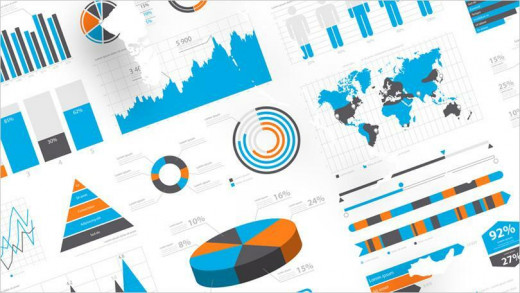
The Different Types of Data Visualization Tools
Data visualization tools come in various types, each with its own unique features and capabilities. The choice of the tool depends on what type of data needs to be visualized and how it will be used.
One type is charts and graphs, which are commonly used to display numerical data such as sales figures or survey results. They come in different forms like bar charts, line graphs, scatter plots, pie charts and more.
Another common type is maps that are mainly used for geographical data. It can help organizations understand demographics or location-based trends because they use colors to indicate intensity levels based on specific metrics.
Dashboards provide an overview of important metrics from multiple sources in one place through the use of widgets. Dashboards allow users to interact with their data by filtering information based on specific criteria.
Infographics combine images with text to convey complex ideas quickly and easily while keeping readers engaged. This type helps present a large amount of information without overwhelming the audience's attention span.
There’s advanced analysis software that allows users to visualize high-dimensional datasets using machine learning algorithms or statistical models.
Choosing the right tool requires considering what kind of data you want to visualize along with your goals for presenting it effectively.
How to Choose the Right Data Visualization Tool
When it comes to choosing the right data visualization tool, there are several factors you should consider. First and foremost, think about your audience and what type of visual representation will best convey your message. Are you presenting to a technical team or a group of non-technical stakeholders? This can greatly impact the complexity and design of your visualizations.
Next, consider the type of data you need to visualize. Some tools may be better suited for numerical data while others excel at displaying geographic or time-based information. Look for features such as interactive maps or timelines if these elements are important to your analysis.
Another important consideration is ease of use and accessibility. Will multiple people need access to the tool? Is it user-friendly enough that non-experts can easily create their own visualizations? Make sure the chosen tool fits within your team's skillset and workflow.
Don't forget about cost-effectiveness. While some advanced visualization tools may have all the bells and whistles, they may not fit within budget constraints. Consider open-source options or free trials before committing to a paid subscription.
Selecting the right data visualization tool requires careful evaluation of audience needs, types of data being analyzed, ease-of-use/accessibility considerations, and cost-effectiveness parameters - always ensuring that it ultimately meets business goals in an effective way!
To sum up, data visualization tools are essential for businesses to make sense of the massive amounts of data they generate. These tools can help organizations identify trends, patterns and insights that would otherwise be difficult to discern from raw data. By using the right visualizations, companies can easily communicate their findings with stakeholders in a compelling way.
When choosing a data visualization tool, it is important to consider factors such as ease of use, functionality and cost. It is also crucial to stay up-to-date with new developments and emerging technologies in this space.
By leveraging the power of data visualization tools, businesses can better understand their customers' needs and preferences while identifying new opportunities for growth. The benefits are clear: faster decision-making processes based on accurate insights that drive results. So don't hesitate - start exploring different types of data visualizations today!